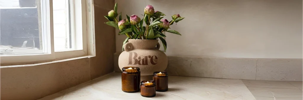
Despite having a strong product lineup and loyal customer base, Bare Tallow’s Shopify store lacked the structure and flow that today’s online shoppers expect. Their digital storefront needed a redesign that could match their authentic, clean brand essence while improving conversion and navigation.
At Mastroke, our goal was to transform Bare Tallow’s Shopify store into a clean, conversion-optimized experience that encouraged users to browse effortlessly, stay longer, and make confident purchases.
We approached this as a UX and CRO-led redesign, combining strategy, structure, and aesthetic consistency to create a store that not only looked better but performed better.
Our first step was understanding Bare Tallow’s customer journey — who they are, what drives their purchase intent, and where friction existed. We identified that the biggest drop-offs were happening on product pages and during navigation.
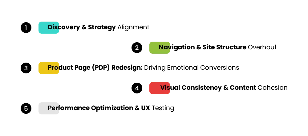
So, our redesign strategy revolved around three core goals:
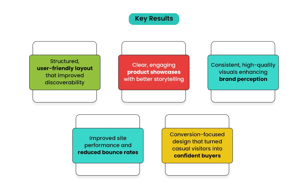
This reorganization ensured that every click had purpose and direction — reducing bounce rates and improving time-on-site metrics.
The product pages were reimagined as conversion assets, not just product displays. We:
The result was a balanced, conversion-ready product presentation that aligned with how customers browse, compare, and decide.
We reworked imagery across the store to maintain visual harmony:
This helped the store look trustworthy and professional, reinforcing the brand’s quality-first positioning.
After design implementation, our technical team conducted a full round of performance testing:
By streamlining both frontend and backend elements, we ensured a faster, frictionless experience — essential for improving conversions.
Our team transformed Bare Tallow’s cluttered, inconsistent Shopify setup into a clean, structured, and conversion-ready store — combining thoughtful design, clear communication, and technical optimization to create a smooth shopping experience that reflected the brand’s purity and authenticity.
Our team brought the new vision for Bare Tallow to life through a balance of creative design and technical precision — turning a conceptual brand idea into a fully functional, modern, and conversion-ready Shopify store.
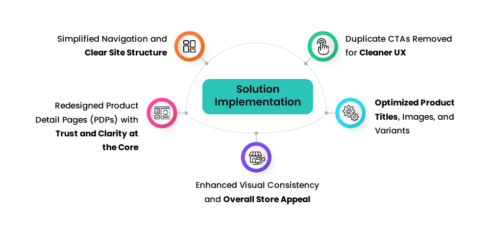
We began by reorganizing the entire store architecture to make navigation intuitive and product discovery effortless. Menus were simplified and restructured to guide visitors through collections logically — from featured categories to individual product pages.
This streamlined structure allowed users to find what they needed faster, reducing bounce rates and improving overall engagement. The result was a clear user flow that balanced aesthetics with function, ensuring every page felt purposeful and easy to explore.
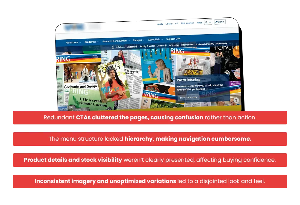
One of the core issues was the presence of repetitive call-to-action buttons that cluttered the user interface and distracted buyers. Our team audited each page to identify overlapping CTAs, removing unnecessary elements while preserving strategic ones that led users deeper into the purchase journey.
This clean-up created a minimal and focused UX, helping users make quicker decisions without confusion — improving the overall clarity of the buying path.
Product pages were restructured to tell a more engaging story while establishing credibility. We divided PDPs into distinct, readable sections — product highlights, ingredients or benefits, reviews, and FAQs — allowing customers to absorb information naturally.
Visual hierarchy was improved using consistent typography, spacing, and trust markers like verified badges and testimonials. Each page was designed to build confidence, reduce hesitation, and gently guide visitors toward conversion.
To strengthen product visibility and brand consistency, we reworked the product catalog in detail. Each title was rewritten with SEO best practices in mind — concise, keyword-rich, and easy to scan.
High-quality images replaced pixelated visuals, ensuring sharpness and color balance across all devices. Variants such as size and fragrance were standardized and displayed clearly to remove confusion during selection.
The goal was to make every product visually appealing, informative, and effortless to explore.
Bare Tallow’s aesthetic relied heavily on natural tones and product purity — yet earlier inconsistencies in image style, spacing, and color tones disrupted brand harmony. We refined every visual element — from banner alignment to product grids — to maintain a cohesive, polished look.
White space was strategically used to create balance, while consistent imagery and typography tied the entire store together. This attention to detail gave the brand a premium, trustworthy identity — one that resonated with its minimalist and organic essence.
The redesigned Bare Tallow store emerged as a structured, conversion-oriented, and visually harmonious platform that simplified navigation and amplified brand storytelling.
From clearer product presentation to faster decision-making, every improvement contributed to a smoother, more confident customer experience — turning browsing into buying.
The redesign went beyond fixing UI issues — it reshaped Bare Tallow’s digital presence into a conversion-centric brand experience.
In essence, we didn’t just rebuild the store — we rebuilt the buying journey.