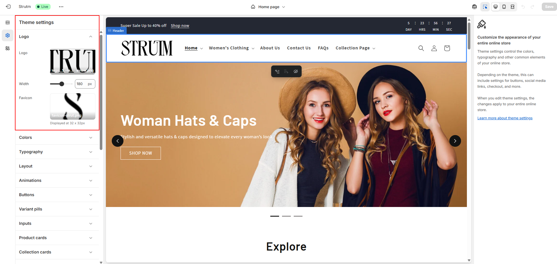
Use the theme settings panel to customize your store’s look and feel. Set global elements like the logo, adjust its width, upload a 32×32 favicon, and more to align with your brand.
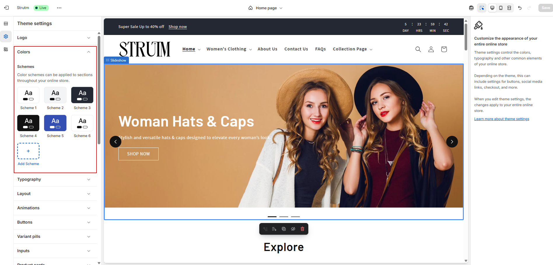
The Mastroke theme uses color schemes to manage colors across sections and elements, ensuring a flexible and visually consistent design.

You can choose fonts for headings and body text, set the font weight, and easily adjust the overall text size using the Base Size range slider. This allows you to change the look and feel of your store without editing individual elements.

Use the Page Width range slider to set a width between 1000 px and 1600 px (default is 1200 px).
Add up to 100 px of vertical space between template sections using the Vertical Space slider.
If using a Grid layout, adjust the Horizontal and Vertical Space sliders to control spacing between grid items, with a maximum of 40 px for both rows and columns.

Reveal sections on scroll to enable a smooth animation as each section appears while scrolling your online store.
Hover effect: Add interactive animations to cards and buttons by selecting one of the following styles:

Adjust the button border using the range slider to customize its appearance.
Make button corners rounded using the corner radius range slider.
Modify the button shadow with the range slider. Set shadow opacity to 0% to remove the shadow entirely.

Use the range slider to adjust the appearance of the variant pill border.
Make variant corners rounded using the corner radius range slider.
Use the range slider to modify the variant pill shadow. Set the shadow opacity to 0% to remove the shadow.
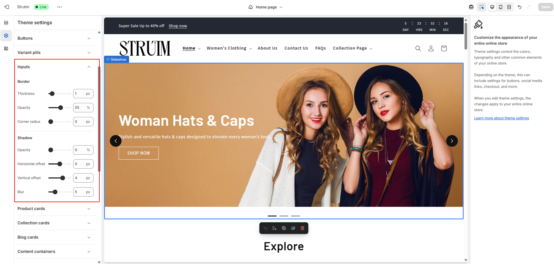
Adjust the appearance of the input border using the range slider.
Make corners rounded using the corner radius range slider.
Modify the input shadow with the range slider. Set the shadow opacity to 0% to remove the shadow.

Add space around your card images using the Image Padding range slider. Choose the Text Alignment for your cards: Left, Center (default), or Right. In the Color Scheme section, click Change to select a color scheme for your cards. Adjust the appearance of the card border using the range slider. Modify the card shadow with the range slider. Set shadow opacity to 0% to remove the shadow.

Add space around your card images using the Image Padding range slider. Choose the Text Alignment for your cards: Left, Center (default), or Right. In the Color Scheme section, click Change to select a color scheme for your cards. Adjust the appearance of the card border using the range slider. Modify the card shadow with the range slider. Set shadow opacity to 0% to remove the shadow.

Add space around your card images using the Image Padding range slider. Choose the Text Alignment for your cards: Left, Center (default), or Right. In the Color Scheme section, click Change to select a color scheme for your cards. Adjust the appearance of the card border using the range slider. Modify the card shadow with the range slider. Set shadow opacity to 0% to remove the shadow.

Adjust the appearance of your content container border using the range slider. Modify the content container shadow with the range slider. Set the shadow opacity to 0% to remove the shadow.

Adjust the appearance of your media border using the range slider. Modify the media shadow with the range slider. Set the shadow opacity to 0% to remove the shadow.

Adjust the appearance of your border using the range slider.
Make corners rounded using the corner radius range slider.
Modify the shadow with the range slider. Set the shadow opacity to 0% to remove the shadow.

Adjust the appearance of your drawer border using the range slider.
Modify the drawer shadow with the range slider. Set the shadow opacity to 0% to remove the shadow.

To choose a badge position, click the Position on cards drop-down and select Bottom left, Bottom right, Top left, or Top right.
Use the Corner Radius range slider to round the corners of your badges. A value of 0 px creates square edges, while higher values make the corners more rounded.
To change the color scheme, click Change under Sale badge color scheme or Sold out badge color scheme, then select your preferred color scheme.
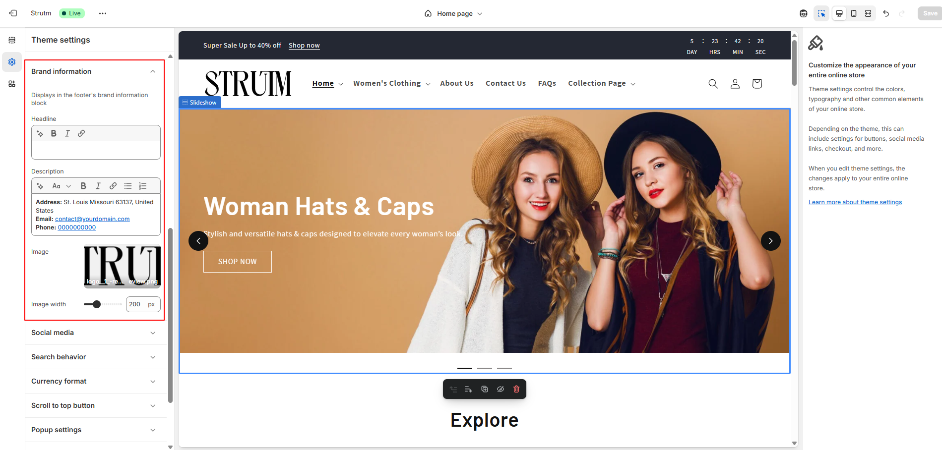
Enter a headline that highlights your brand or business.
Add a description to share more about your brand.

To add links to your social media accounts, enter the full URLs in the appropriate Social Accounts fields — for example: https://instagram.com/shopify or https://tiktok.com/@shopify.

To enable or disable search suggestions, check or uncheck Enable search suggestions.
Optional:
Show or hide the product vendor by selecting or deselecting Show product vendor.
Show or hide the product price by selecting or deselecting Show product price.

Enable Show currency codes to display currency codes.

Customize your Scroll to Top button by enabling the feature and adjusting its appearance and behavior. Choose a hover effect, button style, and content type. You can enter custom button text, upload a custom SVG arrow, set the background color, and position the button using vertical (top) or horizontal (left, center, right) alignment options.

Enable the Custom Popup feature to display a personalized message. Add a main heading, subheading, and upload an image to customize the popup’s appearance.

Enable the Age Verification pop-up to restrict access based on age. Customize it by uploading a verification icon, adding a title and description, setting the text for Yes and No buttons, choosing background and text colors, styling the buttons, and entering a redirect URL for underage users.

Use the Cart type drop-down to choose between Drawer, Page, or Popup notification styles.
Enable the clear cart button on the checkout page for easier cart management. You can also change the text of the button.

The Custom CSS section allows you to add your own CSS code to further customize your store’s appearance. For example, you can modify the look of buttons beyond the default settings or apply unique styles to specific text elements.
Custom CSS in your theme settings will apply to all pages of your store, except the checkout page.
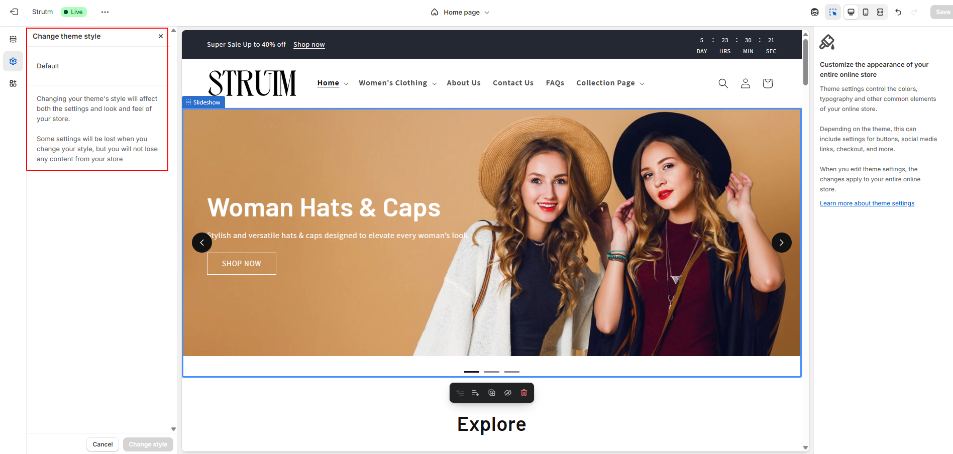
A theme style is a set of pre-selected settings created by the theme designer. Applying a theme style to your store gives it a polished and cohesive look. Each theme comes with a default theme style, and additional options may be available depending on the theme you’re using.
When you customize a theme, you override the default theme style with your settings. Applying a new theme style will update your current settings, such as colors and typography.
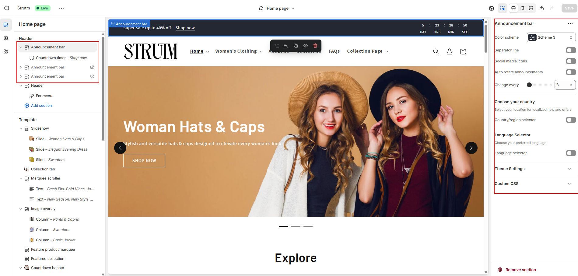
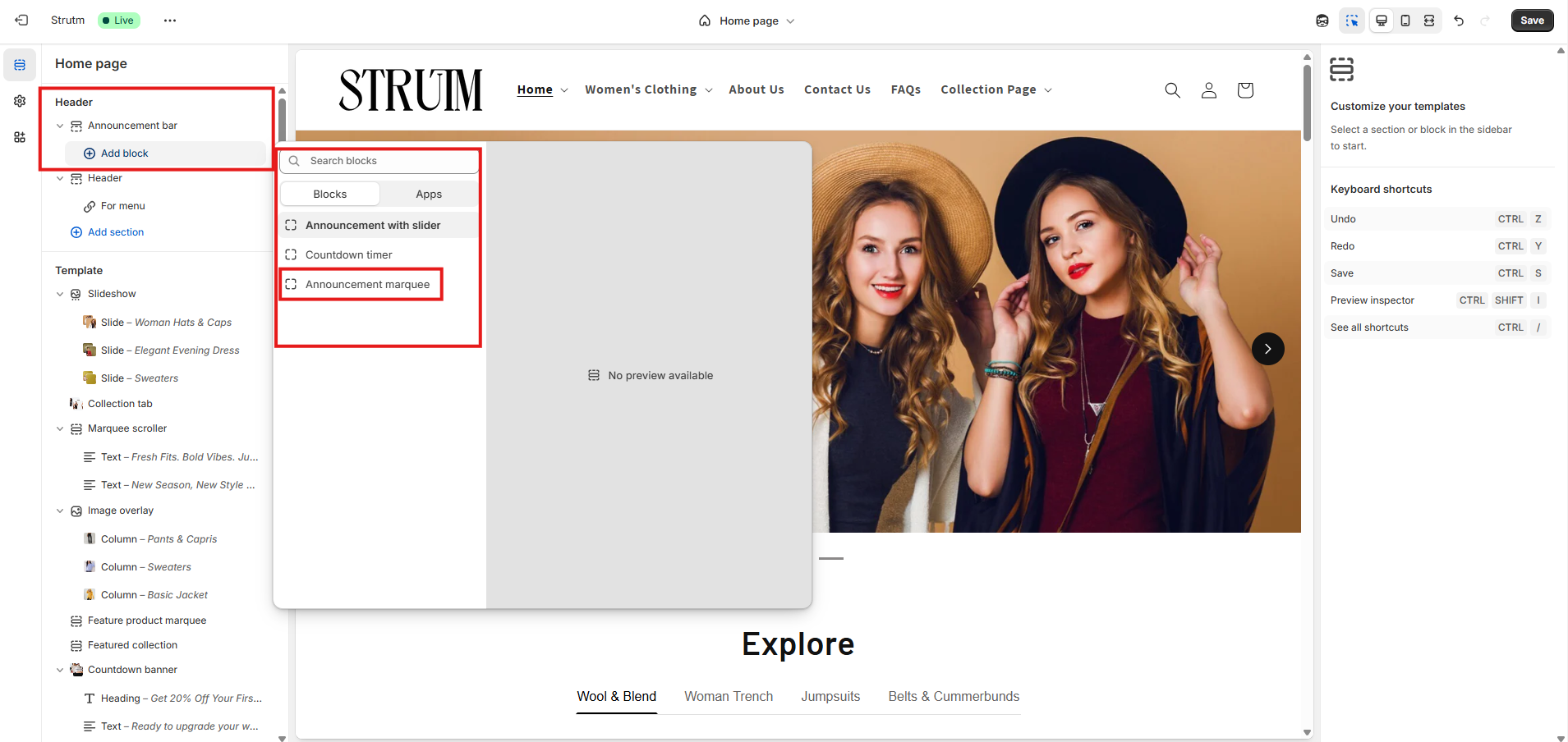
Easily share important updates with your customers from any page using the customizable announcement bar. Add up to 12 announcement blocks, each with its own message.
Enhance the bar by including a language selector, country/region selector, and social media icons. If you have multiple announcements, choose between automatic rotation or manual navigation using chevron buttons.
| Setting | Description |
|---|---|
| Scheme | Apply a predefined set of colors to this section for a consistent and branded look. |
| Show separator line | Displays a visual divider between the announcement bar and the main page content. |
| Social media icons | Displays icons that link to your connected social media accounts. |
| Auto-rotate announcements | Automatically cycles through multiple announcements. |
| Change slides every | Set the time interval for rotating announcements when auto-rotate is enabled. |
| Enable country/region selector | Adds a dropdown for customers to select their country or region, allowing them to view prices in their local currency based on your payment settings. |
| Enable language selector | Adds a dropdown for customers to choose their preferred language, based on the languages enabled in your store settings. |
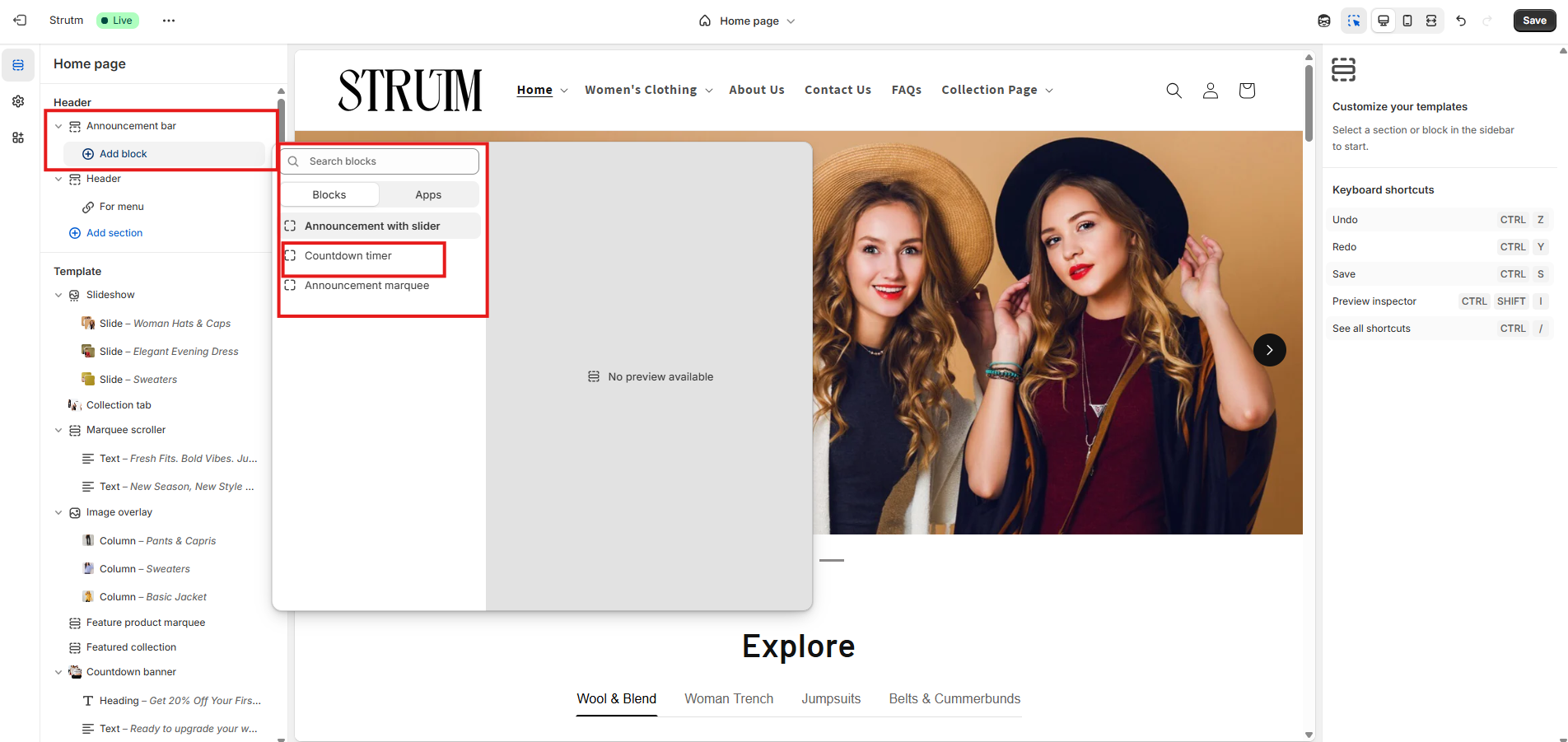
Use the announcement block to display a message with an optional clickable link. This allows you to highlight important updates, promotions, or information, and guide customers to a specific page on your store.
| Setting | Description |
|---|---|
| Text | The message to display in the announcement bar. Use this to highlight promotions, updates, or key information. |
| Link | The URL customers will be directed to when they click the announcement bar. This can lead to a product, collection, blog post, or any relevant page. |
| Slide | Setting | Description |
|---|---|---|
| Slide | Text | The message to display in the announcement bar. Use this to highlight promotions, updates, or key information. |
| Link | The URL customers are taken to when they click the first slide. | |
| Slide 2 | Text | The message shown in the second announcement slide. Useful for showcasing additional offers or messages. |
| Link | The URL customers are taken to when they click the second slide. |
| Setting | Description |
|---|---|
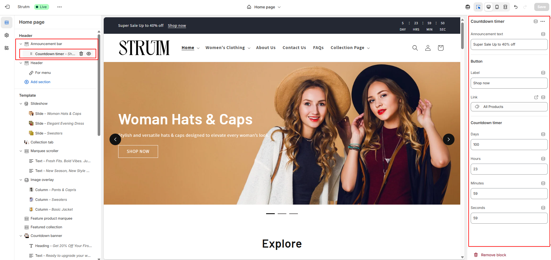
| Announcement Text | The main message displayed above or alongside the countdown timer. Use it to highlight the purpose of the countdown, such as a limited-time offer or upcoming event. |
| Link Label | The clickable text for the link (e.g., "Shop Now", "Learn More") that appears near the announcement or timer. |
| Link | The destination URL where customers will be directed when they click the link label. |
| Countdown Timer | Enables a countdown that visually displays the remaining time for an offer or event. |
| Days | Displays the number of days left until the countdown ends. |
| Hours | Displays the remaining hours. |
| Minutes | Displays the remaining minutes. |
| Seconds | Displays the remaining seconds. |
| Setting | Description |
|---|---|
| First Message | The first announcement message displayed in the marquee. Use it to highlight offers, updates, or important info. |
| First Message Link | The URL customers are directed to when they click the first message. |
| Second Message | The second announcement message displayed in rotation. |
| Second Message Link | The URL customers are directed to when they click the second message. |
| Third Message | The third announcement message displayed in the marquee. |
| Third Message Link | The URL customers are directed to when they click the third message. |
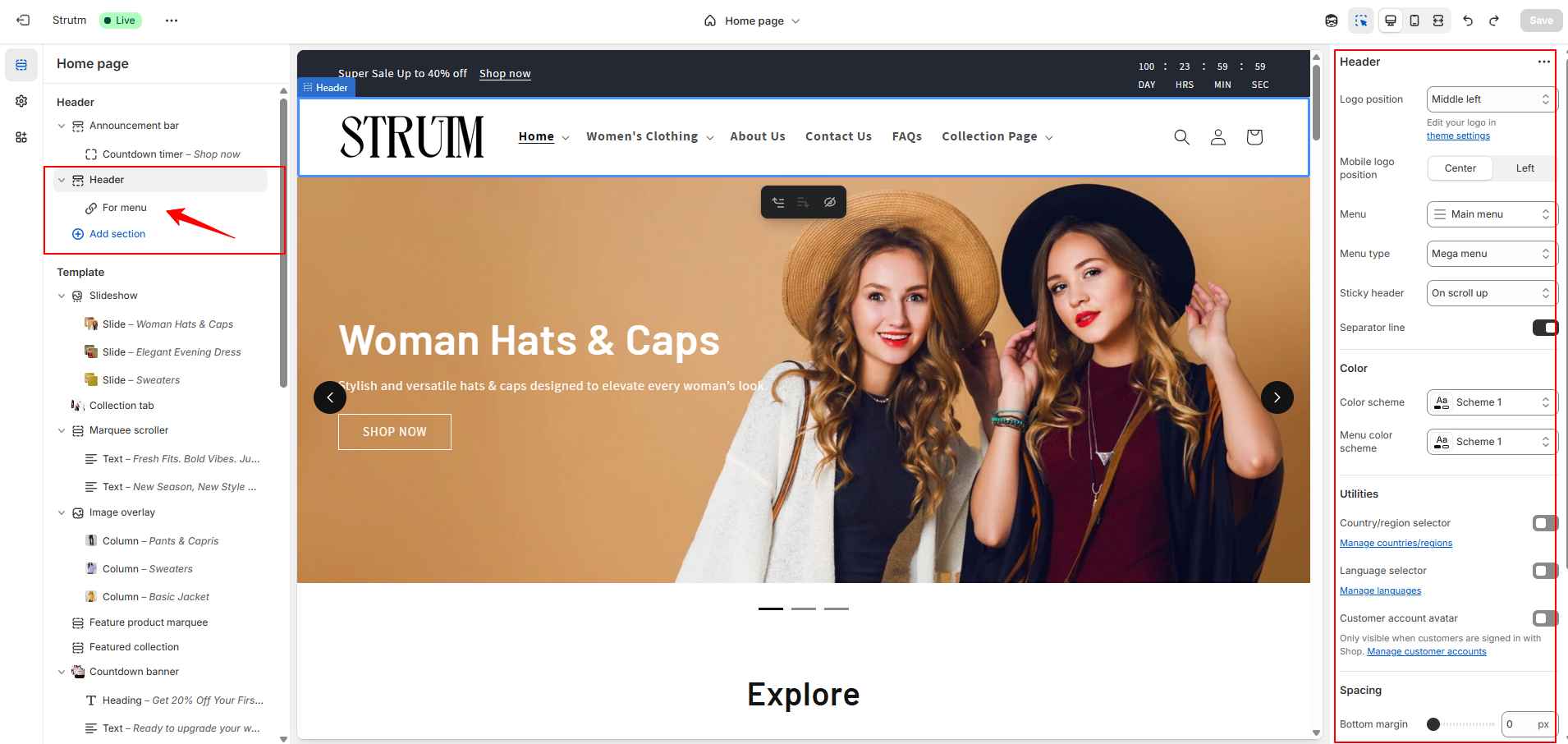
The header is displayed across all pages of your online store, providing consistent navigation and branding.
| Setting | Description |
|---|---|
| Desktop logo position |
Defines the logo placement on desktop screens. The logo position is automatically optimized for
mobile.
|
| Menu | Select the menu to be used as your main navigation. Click Change to choose a different menu. |
| Desktop menu type |
Choose the style of menu display on desktop:
|
| Sticky header |
Choose how the header behaves on scroll:
|
| Show separator line | Adds a line below the header to visually separate it from the page content. |
| Color scheme | Apply a predefined set of colors to the header section. |
| Enable country/region selector | Adds a dropdown for customers to choose their country or region, allowing them to view prices in their local currency (based on your payment settings). |
| Enable language selector | Adds a dropdown for customers to select a language based on your store’s enabled languages. |
| Mobile logo position |
Sets the logo position for mobile devices:
|
| Spacing | Adds bottom margin below the header. Use the range slider to adjust from 0px to 100px. |
| Setting | Description |
|---|---|
| Apps | Add an Online Store 2.0-compatible app block. You can add up to 3 apps, each displayed to the left of the cart icon. App icons are limited to a size of 44px by 44px. |
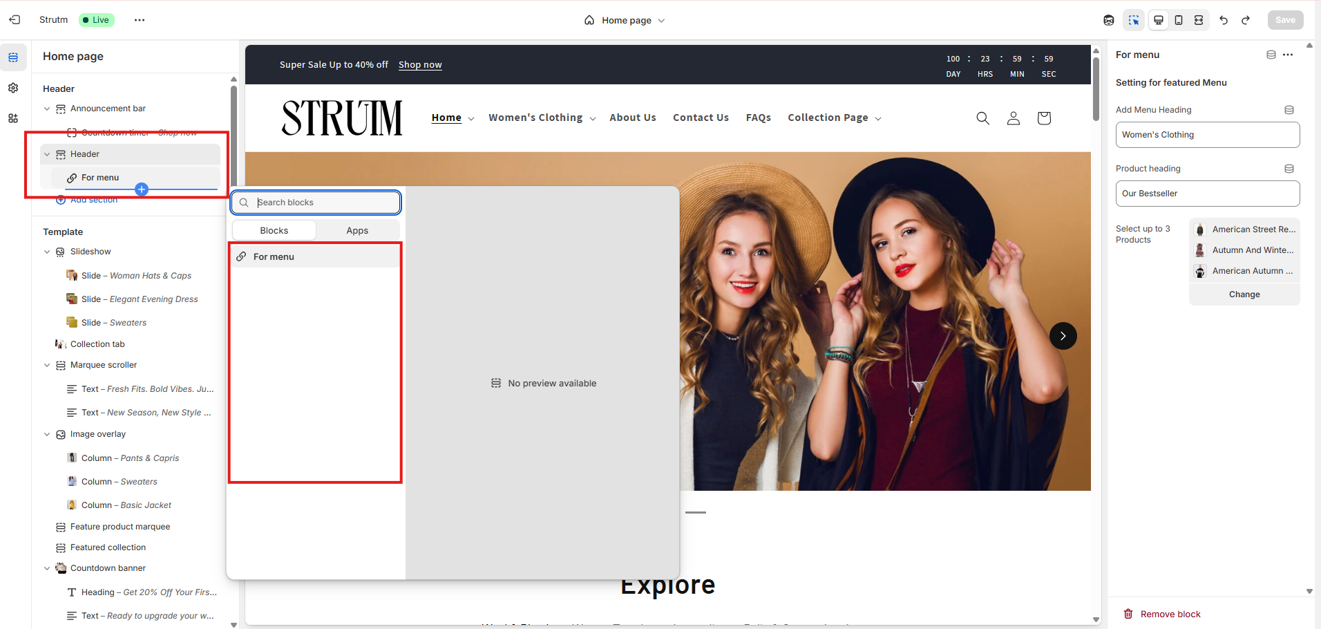
| Menu Heading | Add a heading to label or highlight a featured menu in your header for better visibility and structure. |
| Product Heading | Add a title to the product showcase area under the featured menu, such as "Featured Products" or "Top Picks." |
| Select up to 3 Products | Choose up to three specific products to display directly in the header under the featured menu. This is useful for promotions or best-sellers. |
The footer is displayed consistently across all pages of your online store, providing easy access to important links, information, and branding.
| Setting | Description |
|---|---|
| Color scheme | Apply a predefined color palette to the footer section. Learn more about color schemes. |
| Show email signup | Displays an email signup form, allowing customers to subscribe to your newsletter and marketing emails. |
| Heading | The title displayed above the email signup form. This setting is only visible if the email signup option is enabled. Text formatting options (bold, italic, link) are available. |
| Follow on Shop | Displays a "Follow" button for your store on the Shop app, helping you gain followers and increase visibility. Learn more about Follow on Shop. |
| Social media icons | Shows icons linking to your social media profiles. These icons are pulled from the URLs you’ve added in your theme settings. |
| Enable country/region selector | Adds a dropdown for customers to select their country or region, displaying product prices in their local currency (based on your payment settings). |
| Enable language selector | Adds a dropdown for customers to choose their preferred language (based on your enabled language settings). |
| Show payment icons | Displays icons of active payment methods available on your store. Icons shown depend on the customer's region and currency. |
| Show policy links | Displays store policy links (e.g., Privacy Policy, Terms of Service) next to your copyright. These are managed from Settings > Policies in your Shopify admin. |
| Spacing | Adds space above the footer. Adjust spacing from 0px to 100px using a range slider. |
| Section padding | Adds padding to the top or bottom of the footer section. Adjust from 0px to 100px using a range slider. |
| Brand information (Block) | Add a block that displays your brand logo along with supporting text or a short brand description. Ideal for reinforcing your brand identity in the footer. |
| Setting | Description |
|---|---|
| Heading | The title displayed at the top of the menu block. You can format the text using bold, italics, or include a hyperlink. |
| Menu | Select the menu to display in the footer block. Only top-level menu items are shown; dropdown (nested) menu items won't be displayed in the footer. |
The Brand Information block displays details from your theme settings, such as your store’s logo, name, and description. Manage these details directly in your theme settings.
| Setting | Description |
|---|---|
| Show social media icons | Displays icons for your connected social media platforms. The icons appear only if you’ve added profile links in your theme settings. |
Use the Text block to highlight key information like store details, special promotions, or contact information, helping customers quickly find what matters most.
| Setting | Description |
|---|---|
| Heading | The title displayed at the top of the block. You can format the text using bold, italics, or add a hyperlink. |
| Subtext | The body text displayed below the heading. Use this space to share additional information such as store details, contact info, or promotional messages. |
| Setting | Description |
|---|---|
| Image | Upload or select the image you want to display in this block. |
| Image width | Defines the display width of the image. Choose any value between 50px and 200px, in increments of 5px. The default width is 100px. |
| Image alignment on large screen |
Determines how the image is aligned within the block on larger screens:
|
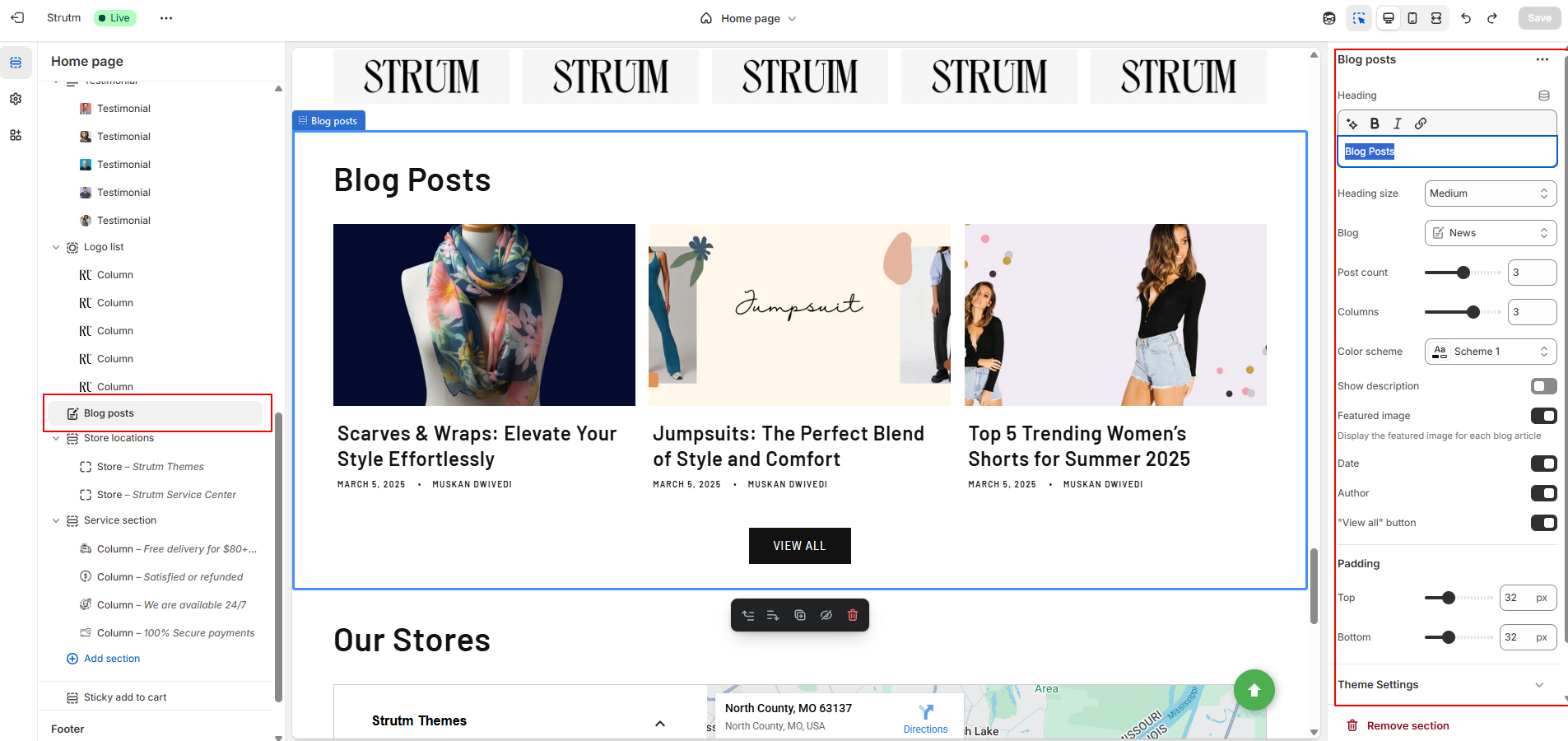
If your Shopify store includes a blog, you can use the Blog Posts section to showcase selected posts. Each post displays the first 55 words from its excerpt. If no excerpt is provided, the first 30 words of the blog content will be shown instead.
| Setting | Description |
|---|---|
| Heading | The title of the section. You can format the text using bold, italics, or include a hyperlink. |
| Heading size | Adjust the heading size. Options include: Small, Medium, or Large. |
| Blog | Select the blog you want to feature posts from. By default, the first blog listed alphabetically on your Blogs page is used. |
| Blog posts | Choose the number of blog posts to display. Maximum: 4 posts. |
| Number of columns on desktop | Set the number of columns to display on desktop. Range: 1 to 4 columns. |
| Color scheme | Apply a color scheme to this section. Learn more about color schemes. |
| Show featured image | Displays each post's featured image. Recommended aspect ratio: 3:2. |
| Show date | Displays the published date of the blog post. |
| Show author | Displays the name of the blog post's author. |
| Enable "View all" button | If more blog posts exist than the number displayed, this setting shows a "View all" button linking to the full blog page. |
| Section padding | Add spacing to the top or bottom of the section. Adjustable from 0px to 100px using a slider. |
In your theme editor, click on the title of the Blog Posts section.
In the Blog section, click Change.
Choose the blog you want to display.
Click Select, then click Save.
Create a dynamic collage with images, products, collections, and videos. Each Collage section
consists of three blocks by default: an image block, a product block, and a collection block. If
you wish to include a video, simply remove one block to add a video block.
To create a collage with more than three blocks, add additional Collage sections below the first
one. Leave the Heading field blank for the subsequent sections to create a seamless,
flowing
layout as a single section.
Recommended Aspect Ratios: For best results, use images with an aspect ratio of either
2:3
or 1:1.
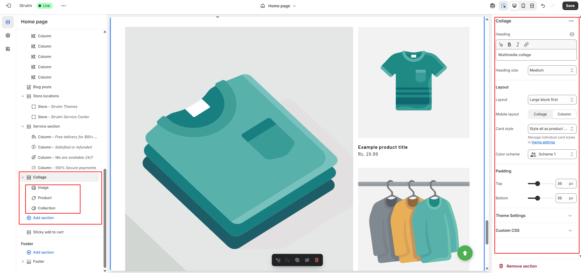
| Setting | Description |
|---|---|
| Heading | The title displayed at the top of the section. You can format the text using bold, italics, or add a hyperlink. |
| Heading size | Adjust the heading text size. Options include: Small, Medium, or Large. |
| Desktop layout |
Determines how the collage media is displayed on desktop:
|
| Mobile layout |
Defines how the collage blocks display on mobile:
|
| Color scheme | Apply a color scheme to this section. Learn more about color schemes. |
| Section padding | Adjust spacing above or below the collage section. Use the range slider to add between 0px and 100px of space. |
| Setting | Description |
|---|---|
| Cover image | The image displayed before the video is played. You can upload a custom cover image from your Shopify admin. |
| URL | The YouTube or Vimeo link to the video. Ensure the video is publicly available. It will play in a pop-up window when clicked. |
| Video alt text | Describes the context and purpose of the video for customers using screen readers, improving accessibility. |
| Setting | Description |
|---|---|
| Product | The product you want to display. |
| Show second image on hover | When a customer hovers over the product image, the second product image will appear, if available. |
| Setting | Description |
|---|---|
| Collection | The collection you want to display. |
| Setting | Description |
|---|---|
| Image | The image for the section. Click Select Image to choose an image, or click Change to update or remove the current image. |
| Edit alt text | Add a brief description for the image to enhance SEO and to provide context for customers using screen readers. |
The collapsible content section allows you to create rows that can be expanded or collapsed to reveal additional content. You can also place an image to the left or right of the collapsible content for a more dynamic layout.
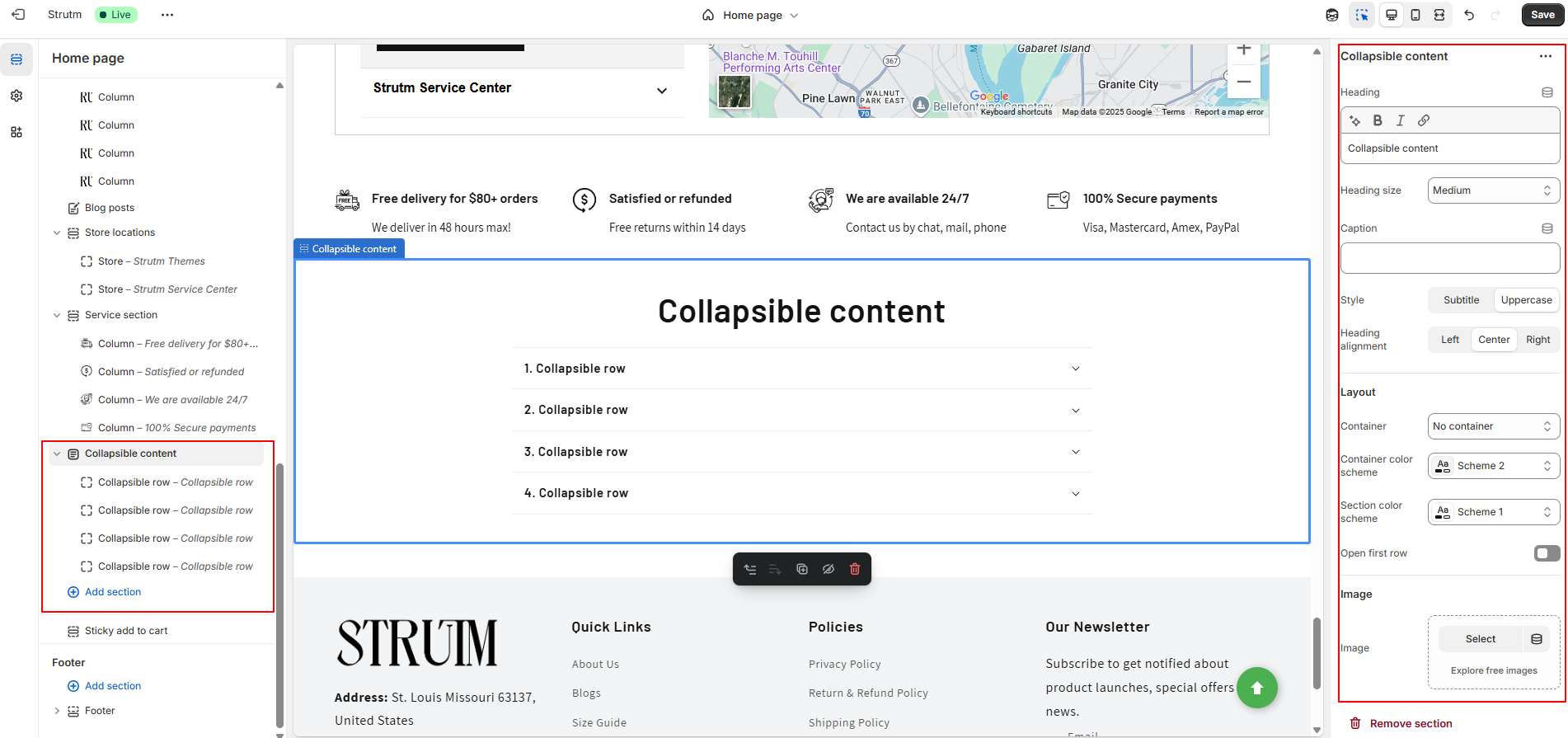
| Setting | Description |
|---|---|
| Caption | An optional caption for the collapsible content section, displayed above the section heading. |
| Heading | The main heading of the collapsible content section. Use formatting options to make the text bold or italic, or to add a link. |
| Heading size | Choose the size of the heading text: Small, Medium, or Large. |
| Heading alignment | Select the alignment for the section heading: Left, Center (default), or Right. |
| Layout |
Choose a layout for your collapsible content:
|
| Color scheme | Apply a color scheme to the section. Learn more about color schemes. |
| Container color scheme | Apply a color scheme to the container, visible only when the Row or Section container layout is selected. |
| Open first collapsible row | When checked, the first row of the collapsible content is expanded by default. |
| Image | Select the image to display in the section. Click Select Image to choose an image or Change to update or remove the image. |
| Edit alt text | Add a brief description of the image to improve SEO and assist customers using screen readers. |
| Image ratio |
Choose the aspect ratio for the section image:
|
| Desktop layout | Choose whether the image or the collapsible rows appear first. The default setting is text first. On mobile, the image always appears first. |
| Section padding | Add spacing to the top or bottom of the collapsible content section. Use the range slider to add between 0px and 100px of space. |
| Setting | Description |
|---|---|
| Heading | A heading for the collapsible row. |
| Icon | Choose an icon from the drop-down list to display next to the collapsible content heading. The check mark icon is selected by default. |
| Row content | The content for the collapsible row. The content can be formatted and include URL links. This feature can also work in conjunction with Row content from page. |
| Row content from page | Insert existing content from another page into the collapsible row. Click Change to select or remove the page. This can be used alongside Row content. |
Use this section to showcase a curated list of collections you want to highlight. You can add up to 16 collection blocks to create a visually engaging grid of featured collections.
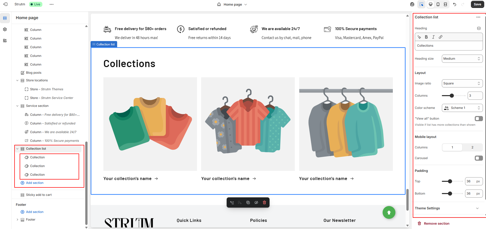
| Setting | Description |
|---|---|
| Heading | The section title. You can format the text (bold, italic, or linked). |
| Heading size | Choose the heading text size: Small, Medium, or Large. |
| Image ratio |
Determines how collection images are displayed:
|
| Number of columns on desktop | Sets how many columns of collections display on desktops. Range: 1 to 5. |
| Color scheme | Apply a predefined color palette to this section. |
| Enable "View all" button | Displays a "View all" button if the number of collections exceeds the ones shown. Redirects users to the collections page. |
| Number of columns on mobile | Choose between 1 or 2 columns for mobile layout. |
| Enable swipe on mobile | Enables a horizontal scroll/swipe layout on mobile instead of stacked columns. |
| Section padding | Adjust top and bottom spacing for this section. Range: 0px to 100px. |
To add a specific collection to a collection block:
The Contact Form sends all submissions to your store’s sender email address. You can update this address from your Shopify admin under Settings > Notifications.
Note: If you're using a third-party domain, make sure to authenticate your domain to ensure email deliverability
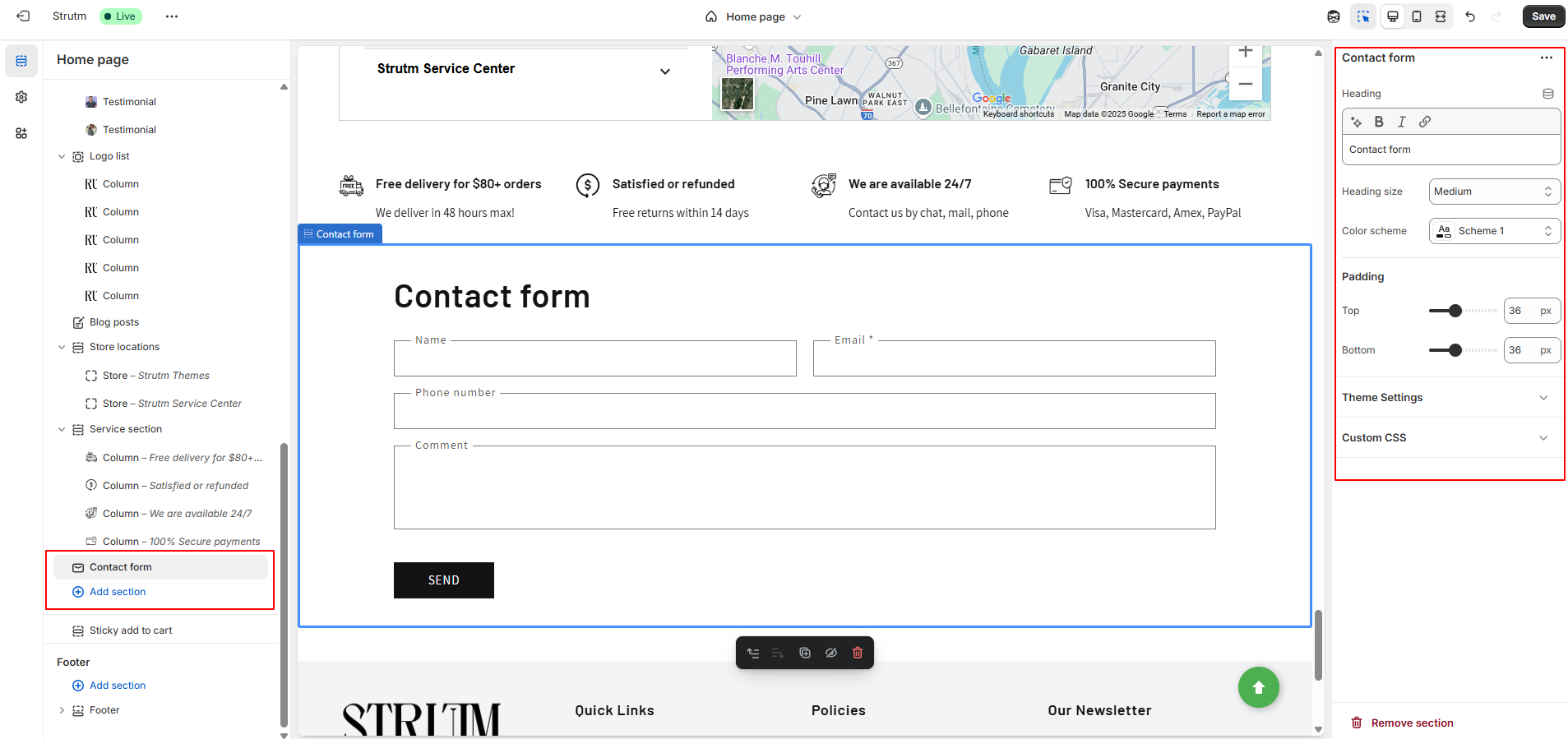
The contact form includes the following fields:
| Setting | Description |
|---|---|
| Heading | The title of the contact form section. Use formatting options to make the text bold, italic, or to add a hyperlink. |
| Heading size | Adjust the size of the heading text. Options include: Small, Medium, or Large. |
| Color scheme | Apply a predefined set of colors to this section. Learn more about color schemes. |
| Section padding | Adds spacing above or below the contact form. Use the range slider to add between 0px and 100px of padding. |
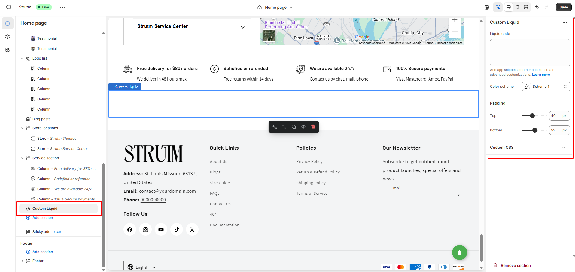
You can use the Custom Liquid section to add your own Liquid code and enhance your theme with custom functionality
| Setting | Description |
|---|---|
| Custom Liquid | Insert app snippets or custom Liquid code to implement advanced features and layout customizations within the section. |
| Color scheme | Choose a predefined set of colors to apply to this section for consistent visual styling. Learn more about color schemes. |
| Section padding | Add spacing to the top or bottom of the section using a range slider (0px to 100px), allowing for better layout control and visual balance. |
You can enhance your password page by adding a section that allows visitors to subscribe with their email address to be notified when your store launches. Each email submission creates a customer account in your store.
This section includes the following default blocks:
| Setting | Description |
|---|---|
| Background image | Sets the banner's background image. Click Change to upload or remove the image. If removed, the default theme image appears. To hide it entirely, uncheck Show background image. |
| Edit alt text | Add alternative text for the image to improve SEO and accessibility for screen readers. |
| Image overlay opacity | Adjusts the darkness of an overlay on top of the image. Use the slider to set the level of opacity (0% is default). |
| Show background image | Toggle this checkbox to show or hide the background image in the banner. |
| Banner height | Sets the height of the banner. Options: Adapt to image, Small, Medium (default), or Large. |
| Desktop content position | Choose the banner content’s vertical and horizontal alignment on desktop: Top, Middle, Bottom with Left, Center (default), or Right. |
| Show container on desktop | Displays the text in a box overlaying the image for desktop users. |
| Desktop content alignment | Aligns the banner text on desktop: Left, Center (default), or Right. |
| Color scheme | Select a predefined color palette. This applies on desktop only if Show container on desktop is enabled, and on mobile if Show content below on mobile is selected. |
| Mobile content alignment | Aligns the text for mobile view: Left, Center (default), or Right. |
| Show content below on mobile | Moves the text below the banner image on mobile devices for better visibility and layout. |
| Setting | Description |
|---|---|
| Heading | The main title displayed at the top of the section. |
| Heading size | Adjusts the size of the heading text. Options include: Small, Medium, or Large. |
| Setting | Description |
|---|---|
| Description | The supporting text displayed beneath the heading in the section. |
| Text style | Defines the appearance of the text. Choose between Body (default) and Subtitle styles. |
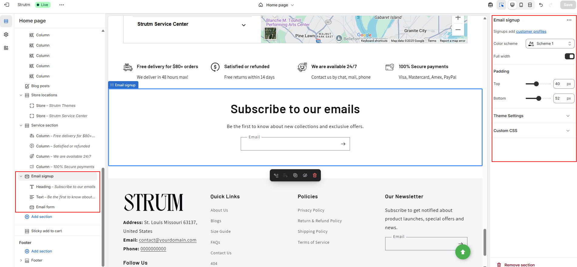
You can add a newsletter signup section to your store where customers can enter their email address to subscribe to your marketing emails. When a customer subscribes, a customer account is automatically created in your Shopify admin.
This section includes three default blocks:
| Setting | Description |
|---|---|
| Color scheme | Apply a predefined set of colors to this section. Learn more about color schemes. |
| Make section full width | Expands the section to span the full width of the browser window. |
| Setting | Description |
|---|---|
| Heading | The section title. You can format it using bold, italic, or add a hyperlink. |
| Setting | Description |
|---|---|
| Description | The descriptive text for the section that explains or complements it. |
The Email form block provides a field where customers can enter their email address to subscribe to your marketing communications. This block does not include any customizable settings.
You can add a section to showcase products from a specific collection. This allows you to highlight featured items or promote a particular product group on your storefront.
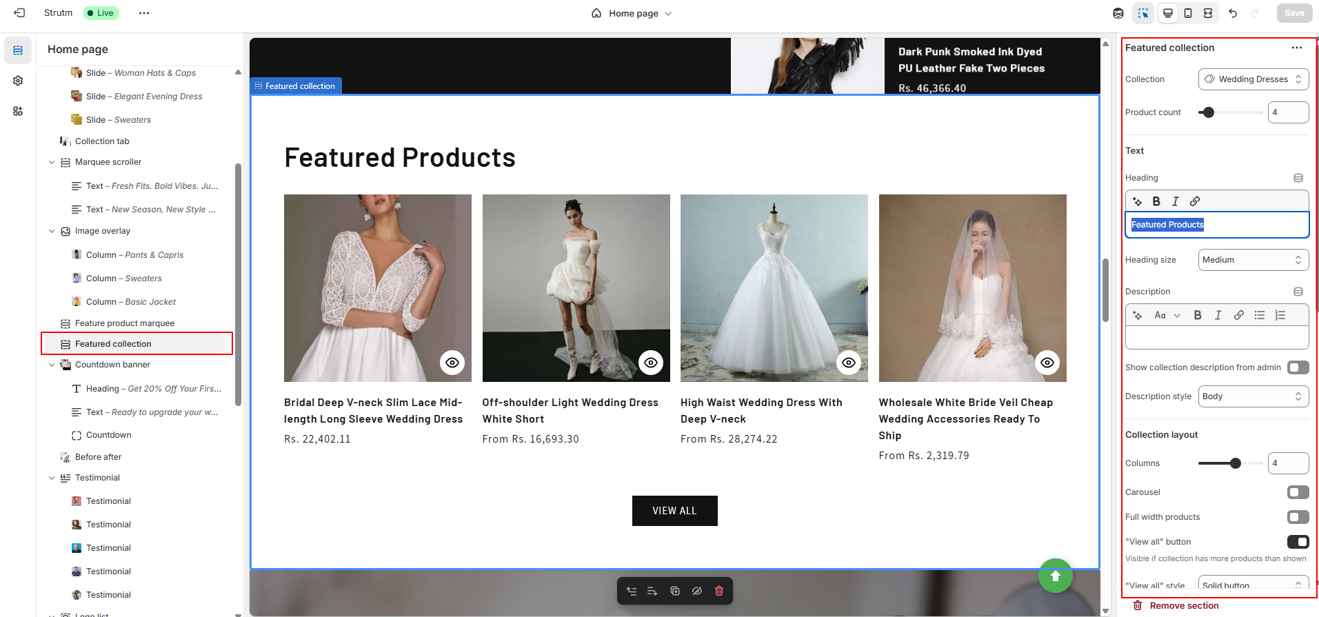
| Setting | Description |
|---|---|
| Heading | Title of the section. Use formatting tools (bold, italic, link) or insert a dynamic source. |
| Heading size | Adjust heading text size: Small, Medium, or Large. |
| Description | Enter formatted text for the featured collection. Supports bold, italics, links, and dynamic sources. |
| Show collection description from the admin | Use the collection description from the Shopify admin instead of the custom description. |
| Description style | Style the description text: Body (default), Subtitle, or Upper case. |
| Collection | Select which collection’s products to display. |
| Maximum products to show | Number of products to display. Range: 2–25. |
| Number of columns on desktop | Set columns for desktop. Range: 1–5. |
| Make products full width | Stretch product grid to full window width. |
| Enable “View all” button if collection has more products than shown | Displays a “View all” button linking to the full collection. |
| “View all” style | Choose link style: Text Link, Bold Button, or Outline Button. |
| Enable carousel on desktop | Show products in a scrollable carousel on screens wider than 989px. |
| Color scheme | Apply a predefined color scheme to the section. |
| Image ratio | Image aspect ratio: Adapt to image (default), Portrait (2:3), or Square (1:1). |
| Image shape | Choose product image shape: Default, Arch, Blob, Chevron Left, Chevron Right, Diamond, Parallelogram, Round. |
| Show second image on hover | Show second product image on hover (if available). |
| Show vendor | Display product vendor name. |
| Show product rating | Display average star ratings and number of reviews. Requires compatible review app and metafields. |
| Buy buttons and quick add | Allow customers to add products directly from the card. Supports quick variant selection if needed. Depends on “Buy it now” being enabled on product page. |
| Number of columns on mobile | Set product columns for mobile: 1 or 2. |
| Enable swipe on mobile | Enable mobile layout to swipe/scroll horizontally. |
| Section padding | Adjust spacing above or below section (0–100px). |
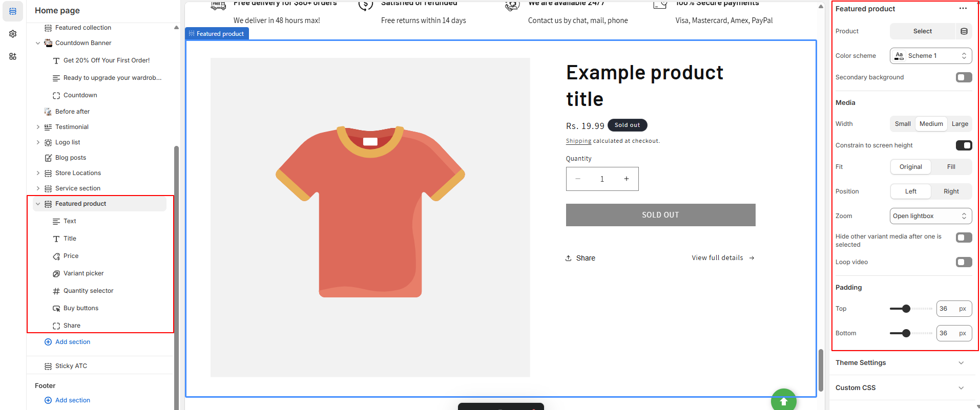
You can add a Featured Product section to highlight a specific product on your store. This section allows you to showcase key product details such as images, price, description, variants, and a call-to-action button, helping drive attention to a particular item.
Use this section to promote a bestseller, new arrival, or limited-time offer—perfect for boosting product visibility and encouraging conversions
| Setting | Description |
|---|---|
| Product | Choose the product that you want to feature in the section. |
| Color scheme | Apply a color scheme to the section. |
| Show secondary background | Display the featured product on a secondary background color. |
| Desktop media width | Select the size of the product media on desktop: small, medium, or large. Images are optimized for mobile automatically. |
| Constrain media to screen height | Limits the height of the media to match the height of the browser window, ensuring the image or video fits within the visible area. |
| Media fit | Choose between Original (keeps the media’s aspect ratio) or Fill (fits the media to the container’s size). |
| Desktop media position | Choose whether to position the featured product media on the left or right of the product details for desktop users. |
| Image zoom | Control how the image zooms on desktop: Open lightbox, No zoom, or Click and hover. This option determines how customers interact with product images. |
| Hide other variants’ media | When selected, hides the media for other variants after one is selected, allowing for a clean and focused product image. |
| Enable video looping | If the featured product includes a video, this option allows the video to loop after it finishes. Customers need to click to restart the video. |
| Section padding | Add spacing to the top or bottom of the section. Use the range slider to adjust between 0px and 100px of space above or below the featured product section. |
| Block | Settings |
|---|---|
| Text | Text: Enter text or dynamic source for the block. Text style: Choose between Body, Subtitle, or Uppercase. |
| Title | Heading size: Choose between Small, Medium, or Large. |
| Price | This block has no customizable settings. |
| Variant Picker | Choose between pills or a drop-down menu for variant selection. |
| Quantity Selector | This block has no customizable settings. |
| Buy Buttons | Check the Show dynamic checkout buttons box to display any dynamic checkout options enabled in your Payments settings. |
| Share | Clickable text that allows customers to share the product to their social media. |
| Product Rating | Displays the average product rating in stars with the number of reviews in parenthesis (e.g., ★★★★☆ (8)). Requires a product review app and metafield definitions. |
| Custom Liquid | Add custom Liquid or HTML code. |
| Apps | Add an Online Store 2.0-compatible app. |
| Icon with Text | Displays up to three icons. Choose from preinstalled icons or upload your own image. You can select a vertical or horizontal layout. |
| SKU | Displays the SKU (stock keeping unit) associated with a product when the variant has an associated SKU. |
The Image Banner Section supports either one or two images, along with a text box and buttons.
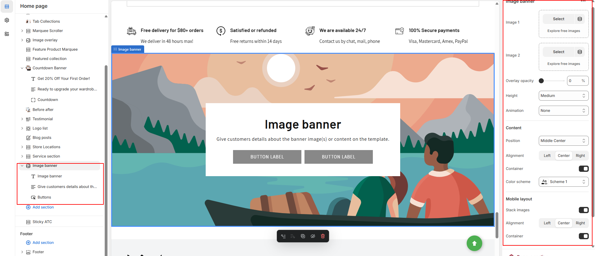
| Setting | Description |
|---|---|
| First image | The main image for the banner. On desktop, it displays on the left; on mobile, it appears at the top. |
| Edit alt text | Set the image’s alt text for SEO and accessibility purposes, describing the image for screen readers. |
| Second image | The secondary image for the banner. On desktop, it appears on the right; on mobile, it displays at the bottom. |
| Image overlay opacity | Add an overlay to the banner images. Use the slider to adjust the opacity (default: 0%). |
| Banner height |
Set the height of the banner images. Options include:
|
| Desktop content position | Choose the position of the desktop image banner: top, middle, or bottom; left, right, or center. |
| Show container on desktop | Displays the text box over the banner image for desktop users. |
| Desktop content alignment | Align the image banner text on desktop: left, right, or center. |
| Color scheme | A set of colors that can be applied to this section. Only visible when “Show container on desktop” is enabled. |
| Animations |
Choose an animation for the image:
|
| Mobile content alignment | Align the image banner text on mobile: left, right, or center. |
| Stack images on mobile | Display images in a column (stacked) on mobile if two images are added. |
| Show container on mobile | Displays the text box over the banner image for mobile users. |
| Setting | Description |
|---|---|
| Heading | Large text for the title of the text box. You can use the buttons to make the text bold or italicized, or to add a link. |
| Heading size | Change the size of the heading text. Choose between small, medium, or large. |
| Setting | Description |
|---|---|
| Description | Displays paragraph-style text. |
| Text style | Changes the style of text in the image banner. Choose between Body, Subtitle, and Uppercase. |
| Setting | Description |
|---|---|
| First button label | The text that displays on the first button. |
| First button link | The URL that you want the first button to link to. |
| Use outline button style | Adjusts the button styling to be an outline of a button instead of having a solid background. |
| Second button label | The text that displays on the second button. |
| Second button link | The URL that you want the second button to link to. |
| Use outline button style | Adjusts the button styling to be an outline of a button instead of having a solid background (applies to second button). |
You can add a section featuring an image and a text block, with the option to include a button that links customers to a new page. This section allows you to highlight a specific product, collection, or blog post. You can use the text to provide additional details such as product availability, style information, or customer reviews. The combination of text and image helps guide customers' attention to key elements of your store.
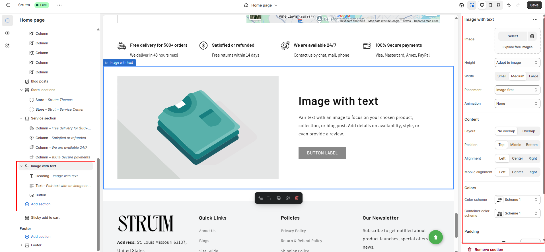
| Setting | Description |
|---|---|
| Image | Click Select image to choose an image for the section. Click the Change button to change or remove the image. |
| Edit alt text | Set image alt text for SEO and describe the image for customers using screen readers. |
| Image height | Choose the height for the image: Adapt to image (default), Small, Medium, Large. |
| Desktop image width | Select image width: Small, Medium (default), Large. |
| Desktop image placement | Choose the order of content: Image first (default for mobile), Image second. |
| Desktop content position | Set vertical content position: Top (default), Middle, Bottom. |
| Desktop content alignment | Align text in the container: Left (default), Center, Right. |
| Content layout | Set how image and text overlap: Overlap, No overlap (default). |
| Color scheme | Apply a color scheme to the section. |
| Animations | Select an animation for the image: None (default), Ambient movement, Zoom in on scroll. |
| Mobile layout | Set content alignment for mobile devices: Left (default), Right, Center. |
| Section padding | Adjust space above or below the section: Between 0px and 100px. |
| Setting | Description |
|---|---|
| Heading | Title text for the section. Use the buttons to make the text bold or italicized, or to add a link. |
| Heading size | Change the size of the heading text. Choose between small, medium, or large. |
| Setting | Description |
|---|---|
| Content | Displays paragraph-style text in the text section. |
| Text style | Style for the content text: Body (default), Subtitle. |
| Setting | Description |
|---|---|
| Button label | The text that displays on the button. |
| Button link | The URL that you want the button to link to. |
| Setting | Description |
|---|---|
| Text | Add a tagline or caption to your image. Text will appear at the bottom of the image with the text section. |
| Text style | Style of the content text: Uppercase (default), Subtitle |
| Text size | Size of the content text: Small, Medium (default), Large |
You can use the multicolumn section to display content in a flexible column layout. This allows you to showcase images and text side by side, focusing on your selected product, collection, or blog post. You can also provide additional details like availability, style, or a customer review. Below the columns, you can add a button that links customers to a new page for more information or to make a purchase.
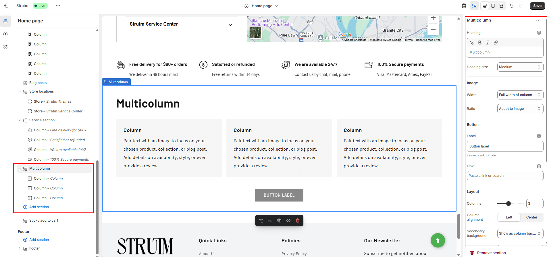
| Setting | Description |
|---|---|
| Heading | The title of the section. Use the buttons to make the text bold or italicized, or to add a link. |
| Heading size | Change the size of the heading text. Choose between small, medium, or large. |
| Image width |
The width of images added to the columns. Full width of column (default) - The width of the image is the full size of the column. Half width of column - The width of the image is half the size of the column. One-third width of column - The width of the image is a third of the size of the column. |
| Image ratio |
The image ratio for the image: Adapt to image (default) - Uses the aspect ratio of the image. This prevents the image from being cropped. Portrait - Crops the image to use a 2:3 ratio. Square - Crops the image to use a 1:1 ratio. Circle - Crops the image to display in a circle. |
| Number of columns on desktop | Select the number of columns that appear on desktop computers (1-6). |
| Column alignment | Align the images and text within the columns: Left (default), Center. |
| Secondary background | Choose None to hide the secondary background, or Show as column background to change the column container colors. |
| Button label | The text that displays on the button. |
| Button link | The URL that you want the button to link to. |
| Color scheme | A set of colors that you can apply to this section. |
| Number of columns on mobile | Set the number of columns for mobile devices (1-2). |
| Enable swipe on mobile | Changes the mobile display from a column to a row, where customers can swipe sideways to see more collection blocks. |
| Section padding | Add spacing to the top or bottom of the multicolumn section. Use the range slider to add between 0px and 100px of space above or below the section. |
You can have a maximum of 12 columns in one section. Depending on the number of column blocks, the layout adjusts as follows:
On mobile devices, all column blocks will stack in a single column. However, if Enable swipe on mobile is enabled, the blocks will be displayed in a row, allowing users to swipe horizontally to view more content.
| Setting | Description |
|---|---|
| Image | The image that you want to display in the column. |
| Heading | The title of the column. You can make the text bold or italicized, or add a link. |
| Description | The paragraph text in the column. This allows you to provide additional details or context. |
| Link label [optional] | The text of a link added below the column block. Leave blank if no link is added. |
| Link | The URL for the link. Leave empty if you do not have a link. |
You can add a section that contains multiple rows, each featuring an image, text, and an optional button. This section allows you to pair text with an image to highlight a specific product, collection, or blog post. You can include additional details such as availability, style, or even a review to enhance the content.
Additionally, you can display content from metaobjects using dynamic sources. To do this, you must create a metaobject, add entries, and ensure that the metaobject has storefront access. Once these steps are completed, you can use the metaobject content in multirow sections.
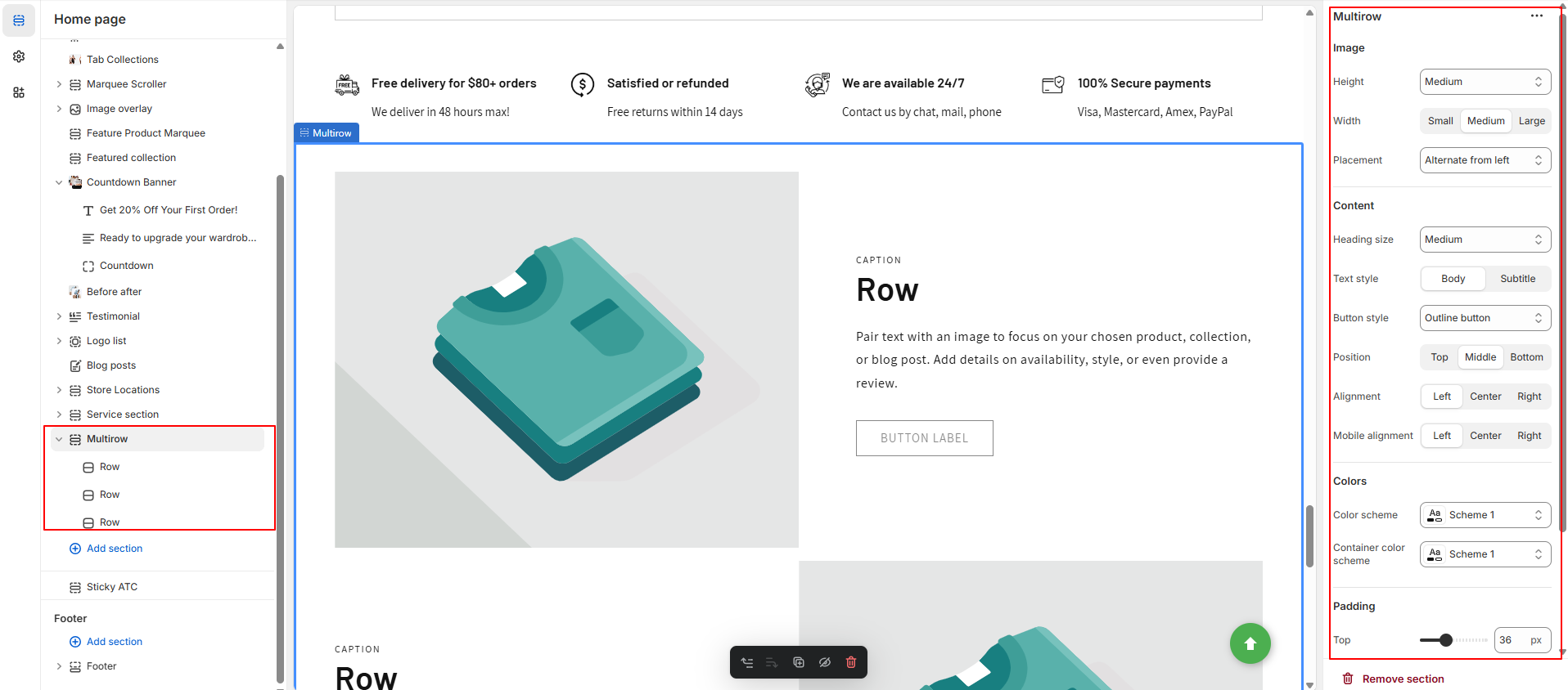
| Setting | Description |
|---|---|
| Image height | Choose the height for the image: Adapt to image (default), Small, Medium, Large. |
| Desktop image width | Choose the width for the image: Small, Medium (default), Large. |
| Heading size | Adjust the size of the heading text: Small, Medium, or Large. |
| Text style | Select the style of text: Body (default) or Subtitle. |
| Button style | Choose between a solid button or an outline button. |
| Desktop content position | Set the vertical position of the content in the container: Top, Middle (default), or Bottom. |
| Desktop content alignment | Align the text within the container: Left (default), Center, or Right. |
| Desktop image placement | Choose the position of the images: Alternate from left (default), Alternate from right, Aligned left, or Aligned right. |
| Color scheme | Select a color scheme for this section. Learn more about color schemes. |
| Container color scheme | Select a color scheme for the container. Learn more about color schemes. |
| Mobile layout | Choose the alignment of content for mobile devices: Left (default), Right, or Center. |
| Section padding | Add spacing above or below the multirow section using a range slider (0px to 100px). |
| Setting | Description |
|---|---|
| Image | Click "Select image" to choose an image for the row. Click the "Change" button to change or remove the image. You can also link to dynamic sources. |
| Edit alt text | Set the image alt text for SEO and to describe the image for screen readers. |
| Caption | Add a tagline or caption to the image. |
| Heading | Title text for the row. Use the buttons to make the text bold or italicized, or to add a link. |
| Text | Displays paragraph-style text in the row. |
| Button label | The text that will be displayed on the button. |
| Button link | The URL to which the button will link. |
You can display the content of a custom page directly within a section. This allows the entire content from the selected page to be shown within the section. However, note that this feature will not include any Liquid code from the page template.
| Setting | Description |
|---|---|
| Page | Select the page from your online store that you want to display in the section. |
| Heading size | Adjust the size of the heading text. Choose between small, medium, or large. |
| Color scheme | Apply a set of colors to the section. Learn more about color schemes. |
| Section padding | Add spacing to the top or bottom of the section. Use the range slider to adjust the padding between 0px and 100px. |
This section is designed to display essential content with a structured and engaging layout, making it easy for customers to read and navigate.
| Setting | Description |
|---|---|
| Desktop content position | Choose the position of the rich text container on desktop. Options: Left, Center (default), Right. Content is optimized for mobile devices automatically. |
| Content alignment | Affects the alignment of text for all blocks within the rich text section. Options: Left, Center (default), Right. |
| Color scheme | Select from predefined color schemes that you can apply to this section. |
| Make section full width | Sections are full width by default, but this option ensures that the section takes the full width of the container. |
| Section padding | Adds spacing to the top or bottom of the rich text section. Use the range slider to add between 0px and 100px of space above or below the section. |
| Connecting to dynamic sources | Use dynamic sources like metafields or metaobjects to reference information, or use list references to output lists within your rich text section. |
You can have up to 3 heading blocks in your rich text section, allowing you to organize your content with multiple headings for clarity and better structure.
| Setting | Description |
|---|---|
| Heading | The title of the section. Use the buttons to make the text bold or italicized, or to add a link. Click the source button to link to dynamic sources. |
| Heading size | Change the size of the heading text. Choose between small, medium, large, or extra large. |
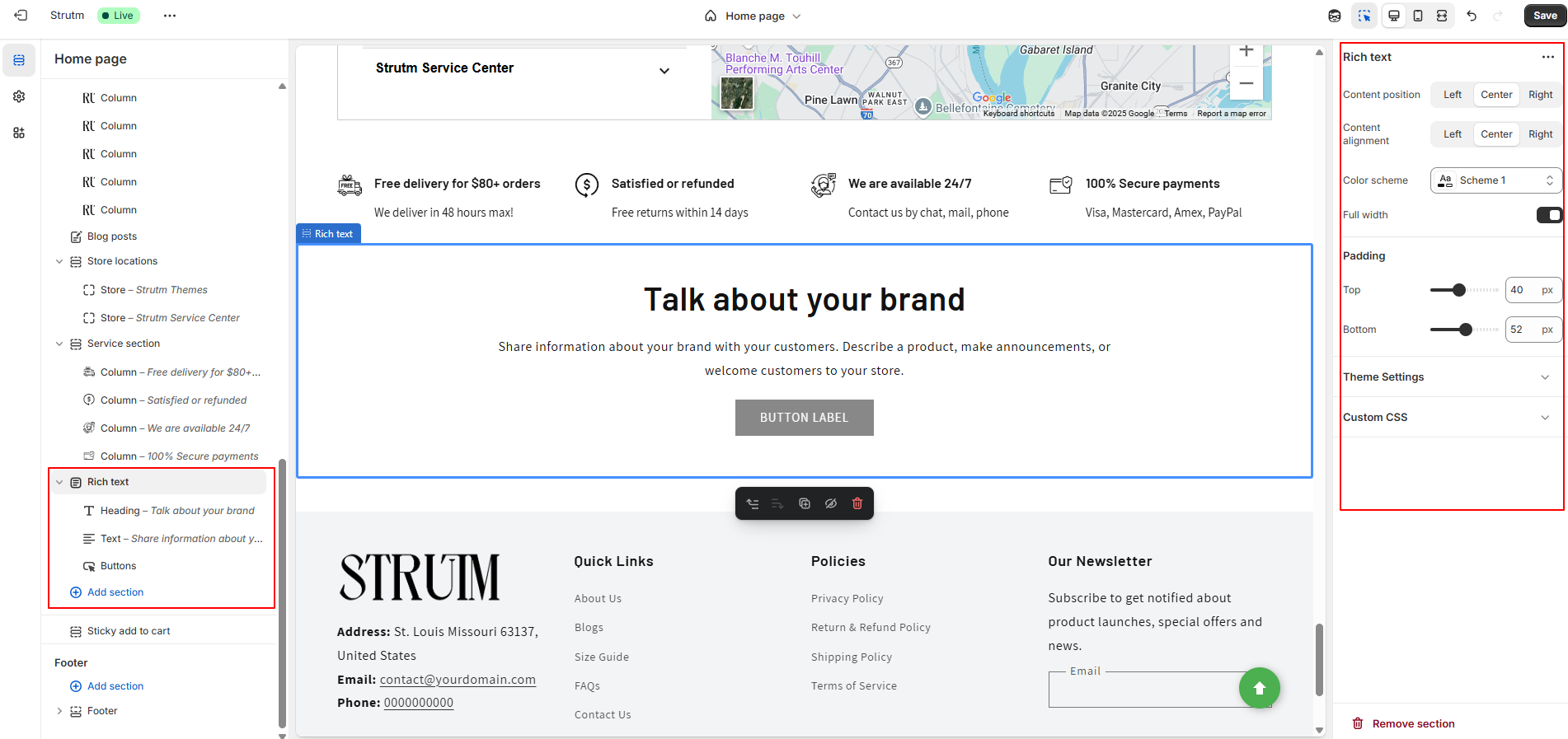
The Text block is an excellent tool for communicating with your customers, allowing you to share important details about your brand. Whether you're describing the benefits of your products, making announcements, welcoming customers to your store, or discussing your brand values, the text block is a versatile way to engage your audience. You can include up to three text blocks in your rich text section for a well-organized and informative presentation.
| Setting | Description |
|---|---|
| Description | Paragraph-style text for the main content of the section. Click the source button to link to dynamic sources. |
You can have up to 3 caption blocks in your rich text section. These caption blocks can help you provide additional context, highlight key details, or add brief descriptions related to the section's content.
| Setting | Description |
|---|---|
| Text | Add a brief tagline to your rich text section. |
| Text style | Use the drop-down menu to select a text style between Subtitle (default) and Uppercase. |
| Text size | Use the drop-down menu to set your caption text size. Choose between small, medium (default), and large. |
You can add up to two button blocks to your rich text section. These buttons can link to external pages or sections within your store to guide customers to important actions or products.
| Setting | Description |
|---|---|
| Button label | The text that appears on the button. |
| Button link | The URL that the button will link to. |
| Use outline button style | Adjusts the button's appearance to be an outline style (instead of a solid background). |
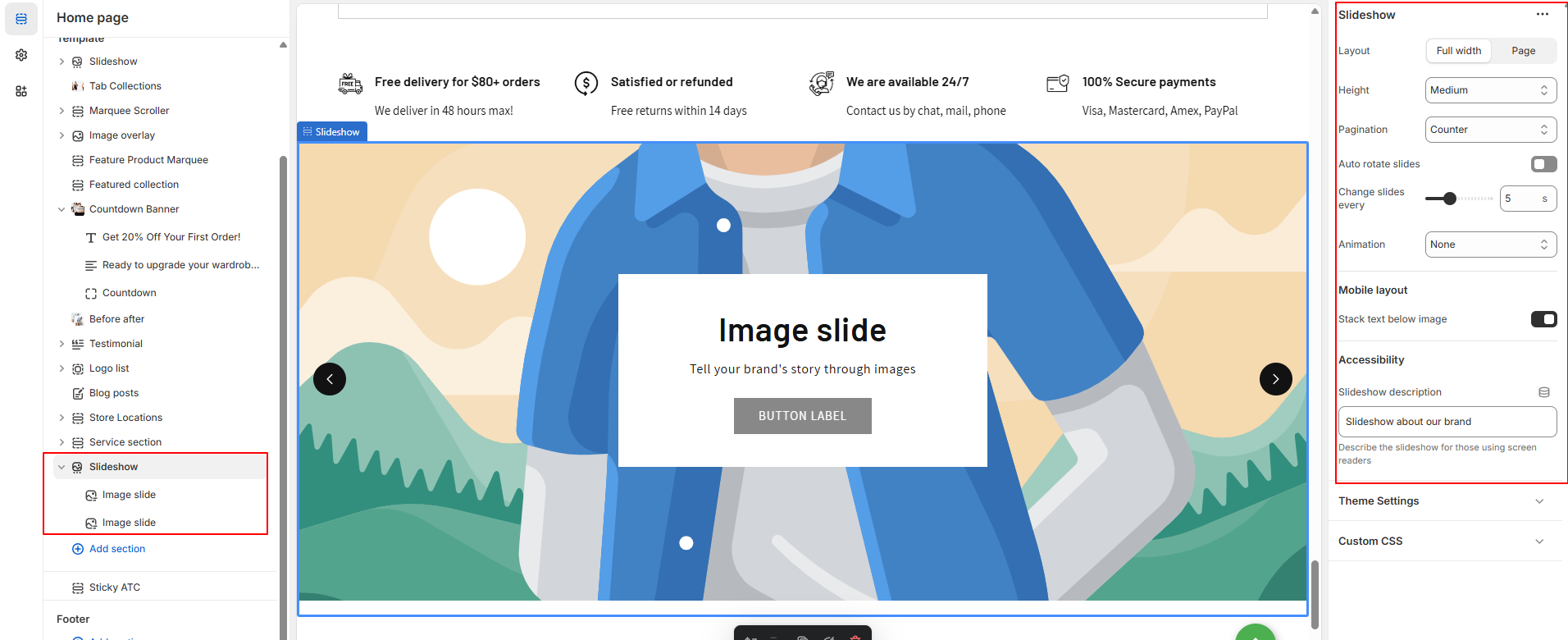
Add a slideshow section to your store to display a carousel of up to five images on any page.
| Setting | Description |
|---|---|
| Layout | Choose between Full width (default) or Grid. Full width stretches the slideshow across the page, while Grid adds padding on each side. |
| Slide height | Controls the slideshow height:
|
| Pagination style | Select the navigation style below the slideshow:
|
| Auto-rotate slides | Enable automatic rotation of slides. If disabled, the slideshow remains static until the user manually changes slides. |
| Change slides timer | Set the auto-rotate interval. Choose between 3 to 9 seconds. |
| Animations | Select a transition effect for images:
|
| Mobile layout | Toggle to display content below images on mobile for better readability and layout. |
| Accessibility | Add an alt text/description for the slideshow to improve accessibility for screen readers. |
| Setting | Description |
|---|---|
| Image | Select a static or dynamic image. Click Select Image to open your media library or use the dynamic source icon. After selection, click Change to update or delete the image. |
| Edit alt text | Add a descriptive text for screen readers to improve accessibility and provide image context. |
| Heading | Optional text displayed on the image. You can bold, italicize, or add a link. This is set per image. |
| Heading size | Choose the heading size: Small, Medium (default), or Large. |
| Subheading | Optional supporting text under the heading. Like the heading, you can format or link it. Set individually per image. |
| Button label | Enter text to display a button. Leave blank if you do not want a button. |
| Button link | Enter the URL the button should link to. You can use a dynamic source for custom URLs. |
| Use outline button style | Enable this option to use an outlined button instead of a solid one. |
| Desktop content position | Choose where to position content over the image: Top, Middle, or Bottom + Left, Center, or Right. Default is Middle Center. |
| Show container on desktop | Toggle to show/hide the content container box on desktop. |
| Desktop content alignment | Choose text alignment within the content box: Left, Center (default), or Right. |
| Image overlay opacity | Adjust the overlay opacity (dark or light tint) using a slider to improve text readability over images. |
| Color scheme | Apply a preset color scheme to the content container. Note: This setting only works if the content container is visible. |
| Mobile layout | Choose how the content appears on mobile: Left, Center (default), or Right aligned. |
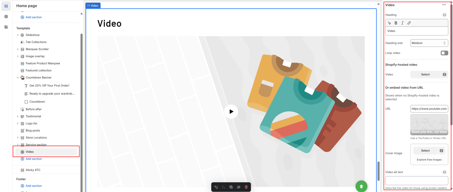
You can add a Video section to embed a video from YouTube or Vimeo on any page in your Shopify store. This is a great way to showcase product demonstrations, brand storytelling, or promotional content directly within your storefront.
| Setting | Description |
|---|---|
| Heading | Title of the section. You can use formatting options (bold, italic, link) for styling. |
| Heading size | Adjust the heading text size. Options: Small, Medium, or Large. |
| Play video on loop | Enable this to have the video restart automatically after it ends. |
| Video | Upload or select a Shopify-hosted video. You can also edit the video to add a custom cover image and alt text. This takes priority over the URL setting. |
| URL | Enter a YouTube or Vimeo link. The video must be publicly available. This is used only if no Shopify-hosted video is selected. |
| Cover image | Image shown before the video plays. Helpful for grabbing attention and maintaining layout consistency. |
| Video alt text | Describes the video content and purpose for screen readers to improve accessibility. |
| Make section full width | Removes side padding, allowing the video to span the full width of the page. |
| Color scheme | Apply a predefined color scheme to customize the section’s background and text colors. |
| Section padding | Adjust the spacing above and below the section (0px to 100px) using range sliders. |
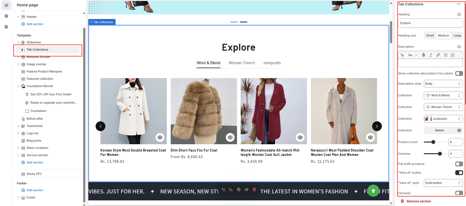
Showcase your curated product collections in stylish tabs, helping customers browse categories quickly and improve their shopping experience.
| Setting Group | Setting | Description |
|---|---|---|
| Heading | Heading | Title for the tab collection section. |
| Heading size | Choose the size: Small, Medium, or Large. | |
| Description | Optional description text shown below the heading. | |
| Description | Show collection description from admin | Display the collection’s description from the admin. |
| Description style | Choose format: Body, Subtitle, or Uppercase. | |
| Collection | Collection | Select the collection to display products from. |
| Product count | Set how many products to show. | |
| Columns | Number of columns in grid layout. | |
| Full width products | Enable to stretch product grid to full width. | |
| "View all" button | Show a button linking to the full collection. | |
| "View all" style | Button style: Link, Outline Button, or Solid Button. | |
| Carousel | Carousel | Enable carousel/sliding product layout. |
| Product Card | Image ratio | Set product image ratio: Adapt to height, Portrait, or Square. |
| Show second image on hover | Toggle to display alternate image when hovered. | |
| Vendor | Show product vendor/brand. | |
| Product rating | Show star rating if reviews are enabled. | |
| Quick add | Choose quick add style: None, Standard, or Bulk. | |
| Mobile Layout | Columns | Set number of columns: 1 or 2. |
| Carousel | Enable carousel layout on mobile. | |
| Padding | Top Set top spacing (in px). Bottom Set bottom spacing (in px). |
A Marquee Scroller displays continuously scrolling text or content across the screen to highlight promotions, announcements, or key updates.
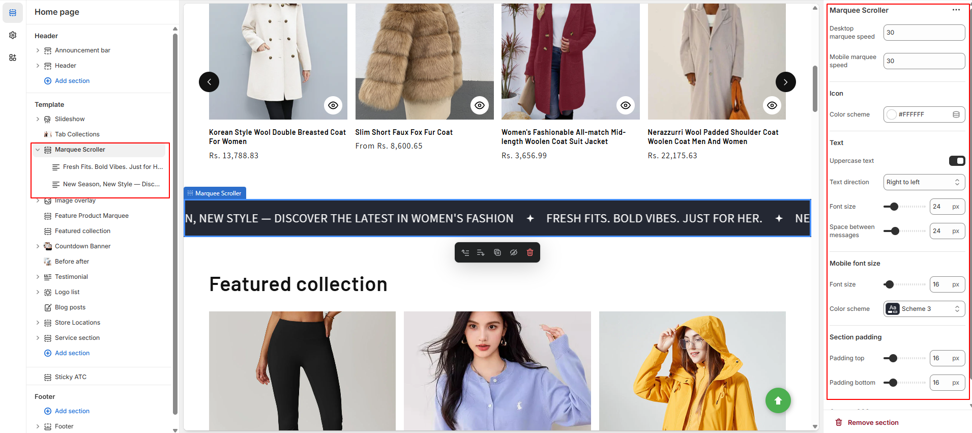
| Setting | Description |
|---|---|
| Desktop marquee speed | Controls the scrolling speed of the marquee on desktop devices. |
| Mobile marquee speed | Controls the scrolling speed of the marquee on mobile devices. |
| Icon color scheme | Select the color scheme for the icons used in the marquee. |
| Enable uppercase text | Toggle to display all marquee text in uppercase. |
| Text direction | Choose the scrolling direction: Left to Right or Right to Left. |
| Font size | Set the font size for the marquee text on desktop. |
| Space between messages | Define the spacing between each message in the scrolling marquee. |
| Mobile font size | Set a different font size for mobile devices. |
| Color scheme | Choose a color scheme for text and background styling. |
| Section padding | Adjust spacing above and below the section using padding top and bottom values. |
| Block Setting | Description |
|---|---|
| Text | The actual text message to be displayed in the scrolling marquee. |
| Icon | Optional icon displayed next to the text in the marquee. |
Add a color overlay over your background image to enhance text visibility and improve visual contrast on the section.
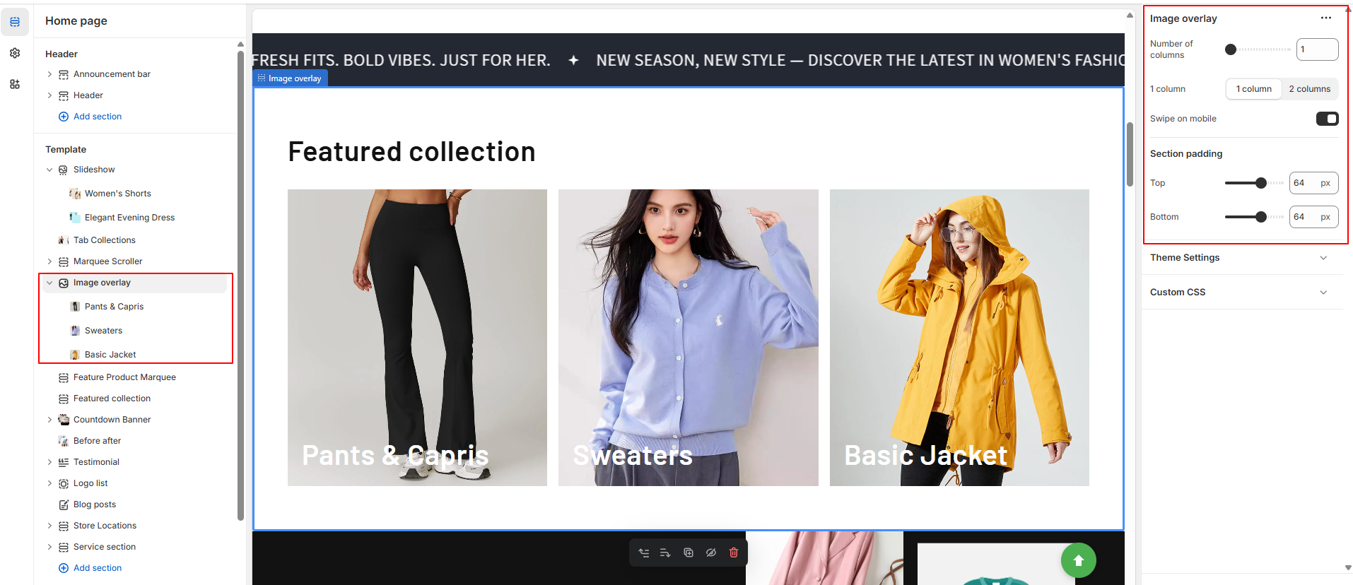
| Setting | Description |
|---|---|
| Number of columns | Set how many columns are displayed in the section. |
| Column | Choose between Column 1 or Column 2 layout styles. |
| Enable swipe on mobile | Allows users to swipe between columns on mobile devices. |
| Section padding (Top) | Add spacing above the section. |
| Section padding (Bottom) | Add spacing below the section. |
| Setting | Description |
|---|---|
| Column | Add visual content using an Image and Heading. |
| Heading size | Choose the size of the heading: Small, Medium, Large, Extra Large, Extra Extra Large. |
| Description | Add supporting text for the column. |
| Button text | The label of the button shown in the column. |
| Button link | The URL the button should link to. |
| Overlay background color | Set the color used for the image overlay. |
| Color | Text color for the content in this block. |
The Featured Product Marquee displays a scrolling row of products from a collection with customizable layout, speed, and styling options.
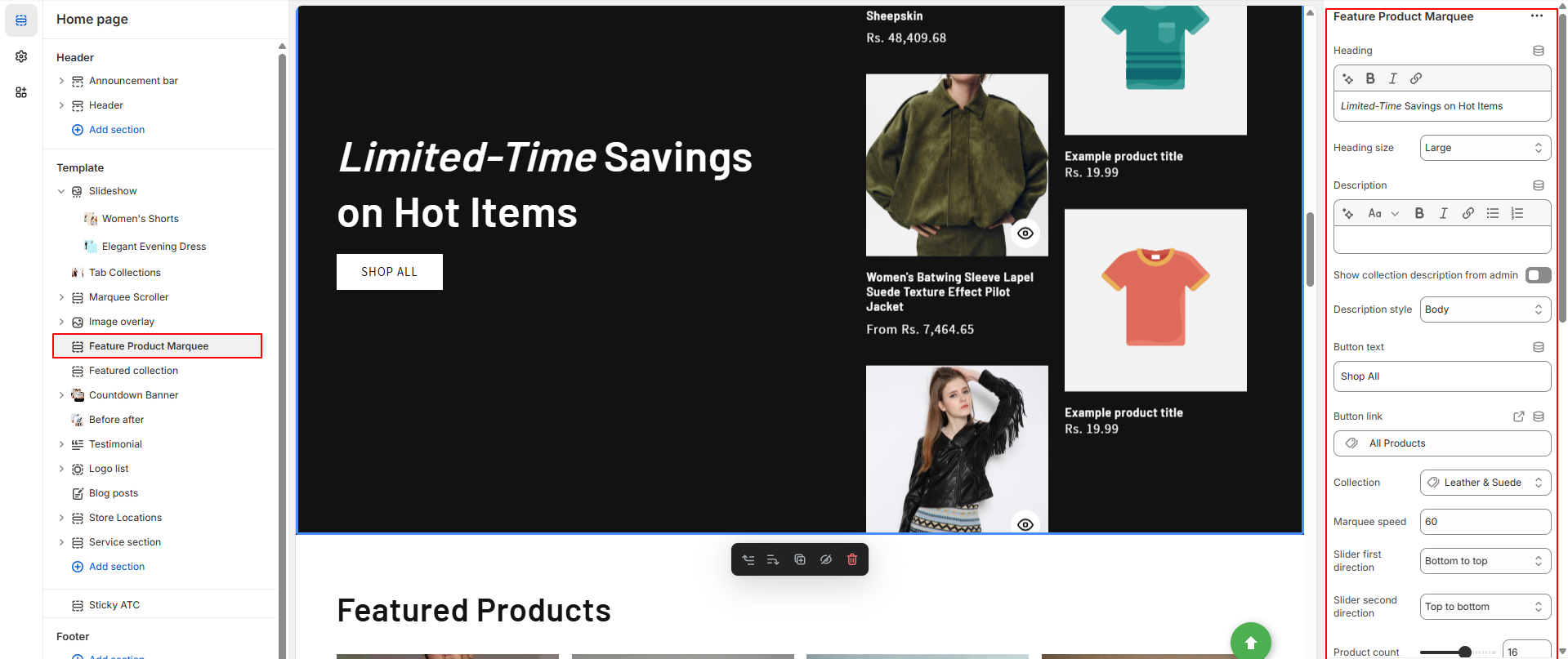
| Setting | Description |
|---|---|
| Heading | Title for the section. Supports bold, italic, or linked text. |
| Heading size | Choose between small, medium, or large for heading text size. |
| Description | Add custom descriptive text for the marquee section. |
| Show collection description | Show collection description directly from Shopify admin (checkbox toggle). |
| Description style | Format description as Body, Subtitle, or Uppercase. |
| Button text | Label for the CTA button (e.g., Shop now). |
| Button link | URL or dynamic source link for the button. |
| Collection | Choose a collection from which to showcase products. |
| Marquee speed | Set the scroll speed of the marquee. |
| Slider first direction | Direction of the first product slider: bottom to top or top to bottom. |
| Slider second direction | Direction of the second product slider: top to bottom or bottom to top. |
| Product count | Limit the number of products to display. |
| Columns | Number of columns visible in desktop view. |
| Color scheme | Apply a predefined color scheme for background and text. |
| Setting | Description |
| Mobile layout - Columns | Select between 1 column or 2 columns on mobile view. |
| Carousel | Enable product carousel on mobile (toggle). |
| Padding - Top | Adjust top spacing (0–100px). |
| Padding - Bottom | Adjust bottom spacing (0–100px). |
Create urgency with a countdown timer banner—perfect for limited-time offers, flash sales, or special holiday promotions.
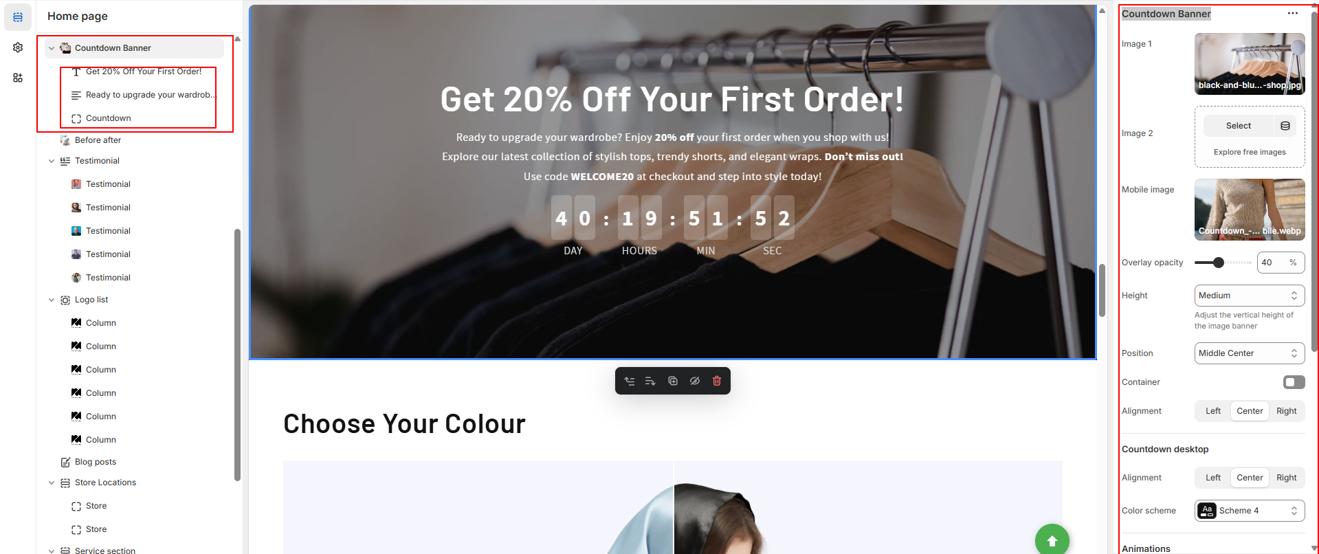
| Setting | Description |
|---|---|
| First image | The main image for the banner. On desktop, it displays on the left; on mobile, it appears at the top. |
| Edit alt text | Set the image's alt text for SEO and accessibility purposes, describing the image for screen readers. |
| Second image | The secondary image for the banner. On desktop, it appears on the right; on mobile, it displays at the bottom. |
| Image overlay opacity | Add an overlay to the banner images. Use the slider to adjust the opacity (default: 0%). |
| Banner height |
Set the height of the banner images. Options include:
|
| Desktop content position | Choose the position of the desktop image banner: top, middle, or bottom; left, right, or center. |
| Show container on desktop | Displays the text box over the banner image for desktop users. |
| Desktop content alignment | Align the image banner text on desktop: left, right, or center. |
| Color scheme | A set of colors that can be applied to this section. Only visible when "Show container on desktop" is enabled. |
| Animations |
Choose an animation for the image:
|
| Mobile content alignment | Align the image banner text on mobile: left, right, or center. |
| Stack images on mobile | Display images in a column (stacked) on mobile if two images are added. |
| Show container on mobile | Displays the text box over the banner image for mobile users. |
| Setting | Description |
|---|---|
| Heading | Large text for the title of the text box. You can use the buttons to make the text bold or italicized, or to add a link. |
| Heading size | Change the size of the heading text. Choose between small, medium, or large. |
| Setting | Description |
|---|---|
| Description | Displays paragraph-style text. |
| Text style | Changes the style of text in the image banner. Choose between Body, Subtitle, and Uppercase. |
| Setting | Description |
|---|---|
| First button label | The text that displays on the first button. |
| First button link | The URL that you want the first button to link to. |
| Use outline button style | Adjusts the button styling to be an outline of a button instead of having a solid background. |
| Second button label | The text that displays on the second button. |
| Second button link | The URL that you want the second button to link to. |
| Use outline button style (second) | Adjusts the button styling to be an outline of a button instead of having a solid background (applies to second button). |
| Setting | Description |
|---|---|
| Countdown style | Choose style (simple or boxed). |
Showcase product transformations or service results by comparing two images with an interactive before-and-after image slider.
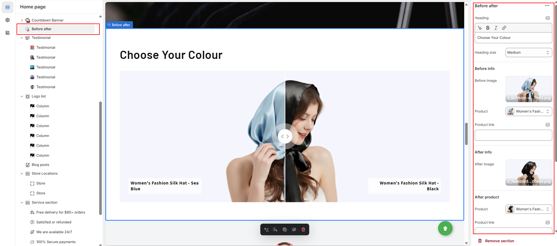
| Setting | Description |
|---|---|
| Heading | Title for the section. Supports basic formatting (bold, italic, link). |
| Heading size | Choose the heading size: Small, Medium, or Large. |
| Before Image | Upload the “Before” image. |
| Before Product | Select a product related to the “Before” image. |
| Before Product link | Add a link to the product for more details or purchase. |
| After Image | Upload the “After” image. |
| After Product | Optional name or label for the “After” state. |
| After Product link | Add a link to the product for more details or purchase. |
| Color scheme | Choose a preset color scheme for text and background styling. |
| Padding | Adjust top and bottom spacing of the section (in px or %). |
Showcase customer feedback and build trust by displaying positive reviews with names, photos, and optional star ratings in a slider layout.
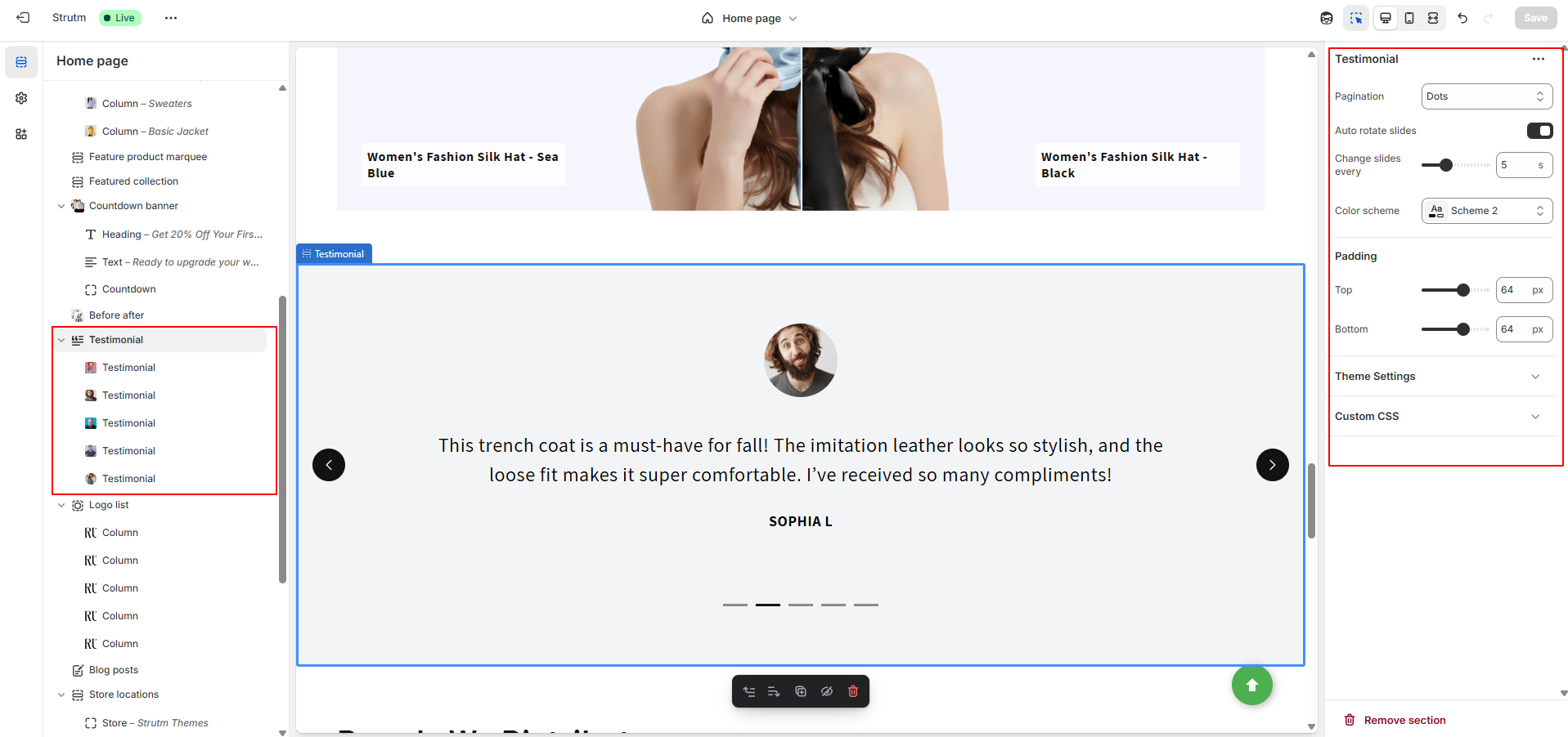
| Setting | Description |
|---|---|
| Pagination | Choose the type of pagination: Dots, Counters, or Numbers. |
| Auto rotate slides | Enable to automatically transition between testimonials. |
| Change slides every | Set interval (in seconds) to change slides when autoplay is enabled. |
| Color scheme | Apply a predefined color scheme to style the section. |
| Setting | Description |
|---|---|
| Author Logo | Upload or select a logo/image representing the testimonial author. |
| Testimonial Text | Add the main feedback or testimonial content. |
| Author Name | Display the name of the customer or testimonial author. |
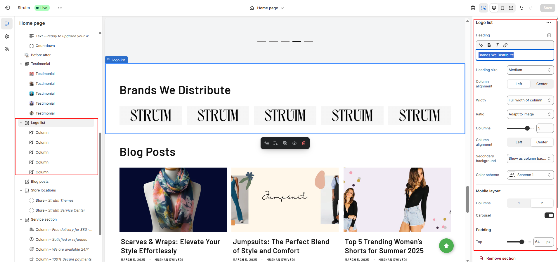
Showcase brand or partner logos in a grid or slider format to build trust and highlight key collaborations or affiliations.
| Setting | Description |
|---|---|
| Heading | Add a title for the logo list section. |
| Heading size | Choose the size of the heading: Small, Medium, or Large. |
| Column alignment | Align logos to the left or right within their columns. |
| Width | Choose how wide the logo section is: One third, Half, or Full width column. |
| Ratio | Choose image shape: Adapt to image, Portrait, Square, or Circle. |
| Columns | Set the number of columns (1 to 6). |
| Secondary background | Option to display a background behind each logo column. |
| Color scheme | Apply a color scheme to this section. |
| Mobile layout | Choose to display logos in 1 or 2 columns on mobile devices. |
| Carousel | Enable or disable carousel for scrolling logos horizontally. |
| Block Setting | Description |
|---|---|
| Image | Upload a logo image. This image will display in the grid or carousel. |
| Link | Add a URL to make the logo clickable. Optional; leave blank for no link. |
Showcase your store locations with map, images, and details to help customers find and visit your physical stores easily.
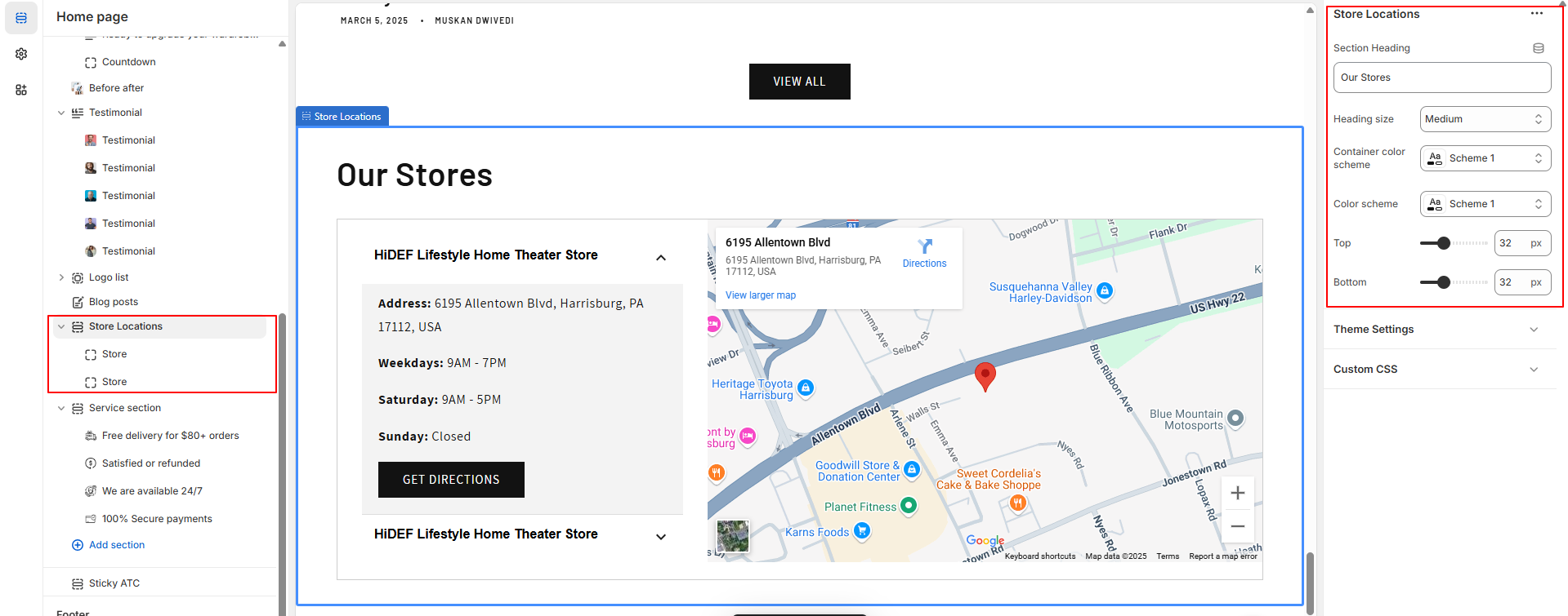
| Setting | Value |
|---|---|
| Section Heading | Store Information |
| Heading Size | Medium |
| Container Color Scheme | Light Background |
| Color Scheme | Dark Text, Light Background |
| Setting | Value |
|---|---|
| Section Heading | Store Information |
| Heading Size | Medium |
| Container Color Scheme | Light Background |
| Color Scheme | Dark Text, Light Background |
| Background-color | #f8f8f8 (Light Gray) |
| Store Name | Cedcoss Technologies |
| Store Address | 1234 Main Street, City, Country |
| Weekday Hours | 9:00 AM - 6:00 PM |
| Saturday Hours | 10:00 AM - 4:00 PM |
| Sunday Hours | Closed |
| Google Map Link Label | View on Google Maps |
| Google Maps Link | Google Maps Link |
| Embed Map URL | "https://maps.google.com/embed?pb=xyz" |
Explore our wide range of services tailored to meet your needs. Quality solutions, personalized support, and reliable expertise.
| Setting | Value |
|---|---|
| Changed Style | Style 2 |
| Heading | What We Offer |
| Heading Size | Extra Large |
| Width | Full Width Column |
| Ratio | Square |
| Columns | 3 |
| Column Alignment | Center |
| Secondary Background | Show as Column Background |
| Label | Explore Services |
| Link | /collections/services |
| Color Scheme | Light Background, Dark Text |
| Mobile Layout | 1 Column |
| Carousel | Enabled |
| Setting | Value |
|---|---|
| Image | service-consulting.jpg |
| Heading | Consulting |
| Description | Professional guidance to help your business grow. |
| Link Label | Learn More |
| Link | /services/consulting |
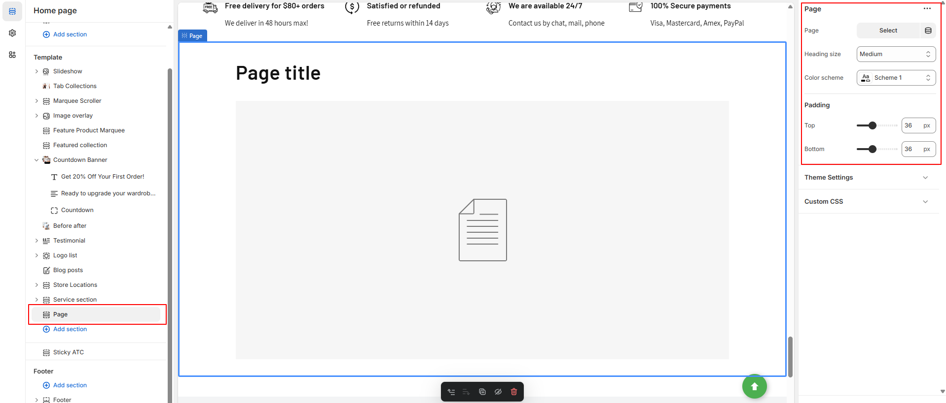
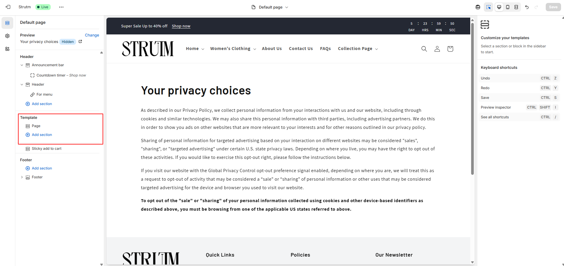
In addition to the default pages (such as the Home, Product, and Collection pages), Shopify provides several other types of pages that you can customize via the theme editor. These pages allow you to personalize various aspects of your online store, making it more tailored to your brand and customer experience.
In Shopify, you can create custom pages to provide additional content for your customers. For example, you can add an About Us page, Contact Us page, or a page with extra information about your products, policies, or services. These pages allow you to customize your store’s content and offer customers more insights.
By default, these custom pages don't come with any pre-configured sections in the theme editor. However, you can fully customize these pages by adding the sections and content you desire. This gives you the flexibility to create a unique experience for your visitors.
You can create a new page by going to Online Store > Pages > Add Page, and adjust the following settings for each custom page:
| Setting | Description |
|---|---|
| Top padding | Set the amount of space at the top of the section. This controls the space above the content, allowing for visual balance. |
| Bottom padding | Set the amount of space at the bottom of the section. This controls the space below the content, helping to create separation from other sections. |
You can add more sections to each page using the Add Section button.
This will close in 0 seconds
GROWING SHOPIFY BRANDS
This will close in 0 seconds
GROWING SHOPIFY BRANDS
This will close in 0 seconds