What is Banner Blindness? And the 7 Clever Ways To Avoid It
Banner blindness is often observed when website users subconsciously (sometimes even consciously) skip viewing banner advertisements. It usually happens because users don’t want to get distracted by ads but instead focus entirely on what they seek.
With the overuse of banner ads and the constant bombardment of users with irrelevant content, banner blindness is a challenge many companies face.
How banner blindness affects businesses?
Banner ads are creative ads occupying a website’s top, side, or bottom parts. Advertisers strategically place them to drive traffic to their site, create brand awareness, and generate instant brand recall.
Banner blindness poses a challenge for advertisers as they struggle to encourage users to engage with their ads and increase their ad click-through rates. Online users today are habituated to seeing banner ads everywhere, so they no longer pay attention to them. So even if the banner ads can be a product or a service related to their need, they may still need to pay attention & eventually not buy it.
This is primarily a challenge as advertisers are paying money to run banner ads, but the purpose of educating the target audience is still not being met. Eventually, resulting in a loss of ROI, a loss of leads, and a decrease in conversions. Banner blindness highly impacts eCommerce businesses that, in one way or another, depend on the internet for sales.
The science behind banner blindness
First used in 1998, banner blindness was recorded as a result of usability testing conducted on websites. It was noted that a majority of test subjects chose to ignore information (consciously as well as unconsciously) presented in the form of banners.
The science behind banner blindness is often said to be rooted in cognitive psychology and attentional processes.
According to cognitive psychology, humans tend to have limited attentional resources and are able to focus entirely on limited amounts of information at once. Therefore, when a webpage has a mixed combination of excessive visual elements, visitors often choose to prioritize their attention to the most relevant information that’s important to them.
Moreover, as banner ads have a distinct appearance that differs from the rest of the content on a webpage, users are able to identify & differentiate them from the main content easily. However, if the banner ads do not serve the purpose of being relevant, they are more likely to get overlooked by the user.
It is worth noting that users often relate banner ads with promotional, sales-oriented content and have, as a result, developed the perspective that banner ads do not add to the value, further adding to banner blindness.
Note: Ad-blocking software and the rise of intrusive ads have fueled negative perspectives toward online advertising. This further contributes to an increase in banner blindness.
What are the consequences of Banner Blindness?
The 6 consequences of banner blindness are:
- As users ignore banner ads, the click-through rate or CTR decreases
- Reduction in conversion rates as a result of decreased CTR
- Lower return on investment
- Wasted ad spend as the ads fail to reach and derive a CTR
- Negative brand perception can impact brand credibility
- Massive miss in revenue opportunities
Is banner advertising really profitable?
With a well-planned strategy and adequate ad placements on a web design, banner ads can be helpful in drawing higher CTR and eventually bring in more lead conversions.
However, poorly placed banner ads can cause a significant decrease in click-through rates as well as harm a brand’s credibility.
Pro tip: If you are looking to enhance your brand’s banner ads but don’t know where to start, you can reach out to our PPC experts
Types of Banner Blindness and 5 Reasons Why Your Audience is Turning Banner Blind
Visual Masking: This occurs when advertisers place banner ads in close proximity to text content, making it difficult for the reader to distinguish between ads and text content. Readers often overlook ads placed at the top or bottom of a webpage.
Similarly, ads placed close to content users are looking for can lead to banner blindness too. It is important to place ads where they do not mix up with other distracting elements.
Intrusive ads: Notorious for presenting invasive, irrelevant, and unexpected ads in front of consumers, intrusive ads can significantly decrease page viewer experience. These are often unexpected pop-ups, distracting ad videos that play on their own, and ads that trigger the opening of multiple new pages.
Usefulness and relevance: Everyone on the internet is looking for something. With banner ads that do not serve the purpose or offer irrelevant content, users often get ad fatigue. A phenomenon where they choose to ignore ads or look past them regardless of their placement (leading to banner blindness). It is, therefore, always important to target your ads carefully to attract the audience’s attention.
Visual recognition of the ad: Lack of creativity in ads can kill ROI potential. Banner Blindness by design is caused when poorly designed banner ads are overlooked due to a lack of relevancy and aesthetic appeal. Creating visually impactful ads helps them stand out from text content (instead of blending in) and grabs user attention.
Habituation and Semantic Satiation: Over the years, people have become accustomed to seeing banner ads all over the internet and have therefore chosen to ignore them until and unless these are related to their needs. A banner ad loses its meaning due to users getting exposed to it on a repeated basis. So, it is also important to not bombard users with ads but instead only provide adequate information without being pushy
How to Avoid Banner Blindness – 7 Clever Must-try Ways
Position your ads right
Viewers over the years have learned to look past banner ads that are interesting or informative enough. This makes it more critical than ever to create banner ads that are aesthetically attractive while conveying information without being overly pushy.
Moreover, adequate ad positioning can help determine if the ads are engaging enough or need improvement. Ads placed at the bottom or top of the page often get ignored.
Banner ads that advertisers place on the sides often end up blending with the content and don’t fetch desired attention from users. It is always best to test-run multiple banner ad formats to find the right balance of ads and content ratio.
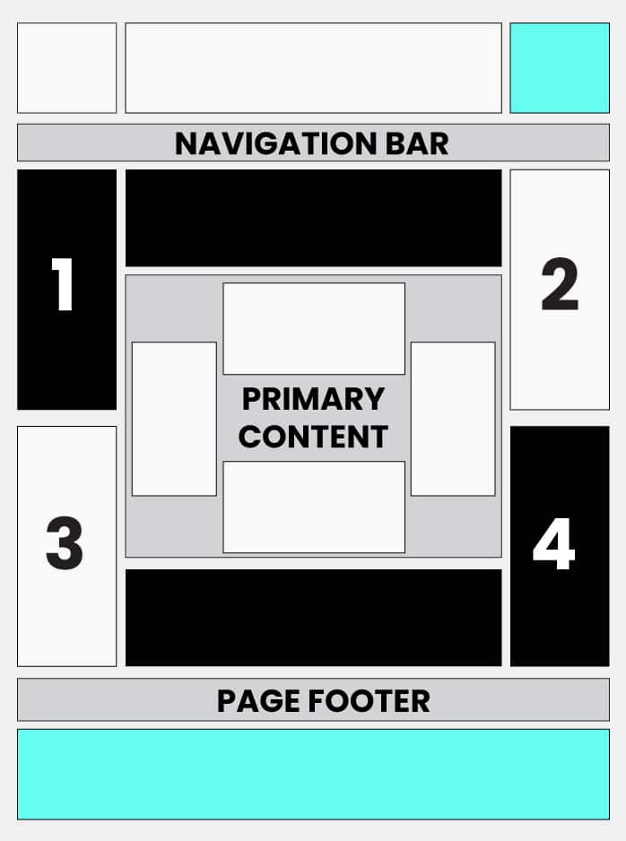
Understanding how people consume content online can benefit designing web design that draws engagement and eventually leads to conversions. The intention should be to create an experience similar to reading physical page content, focusing on the arrangement of content from most important(top) to least(bottom).
The above image shows the general reading pattern often observed in online users.
Here are some banner ads dimensions that can help in avoiding banner blindness:
- 300×600: Also known as a “half-page ad,” this format offers more space for creative designs and messaging
- 970×250: Also known as a “billboard ad,” this format is a large, rectangular ad that offers plenty of room for messaging and visuals
- 336×280: Also known as a “large rectangle,” this format is a good size for displaying text and images without taking up too much space on the page
- 728×90: Also known as a “leaderboard ad,” this format is a long and narrow banner that can be placed at the top or bottom of a webpage
- 300×250: Also known as a “medium rectangle,” this format is a standard size that is versatile and can be used in a variety of placements on a webpage
Tip: Avoid making banner ad content that resembles ads. Instead, customize them to stand out with the right font, color, and even size selection.
Make the content relevant to the need:
People often equate banner ads to being spammy, pushy, unwanted, and even annoying. So how can your brand do something that is different and garner attention? Create content that offers value and aims at solving a problem.
It is essential to understand the needs and interests of your target audience. This information comes in handy to create ads that strike a chord with your audience. Using customized content encourages people to engage more easily.
Ad personalization to combat banner blindness:
Imagine reading about a recipe online and seeing banner ads for the next trekking tour. You will surely ignore these advertisements as they are irrelevant to what you are looking for.
Neither do they offer value you can use later. Ad personalization increases the relevance of ads. This, in turn, makes them more likely to grab user attention easily.
By using personalization in banner ads, advertisers can effectively combat banner blindness by offering ads that are relevant to users’ interests and needs.
This can significantly increase their likelihood of seeing and engaging with your ads. Moreover, personalized banner ads improve the user experience while providing what they are looking for.
Continuous A/B Testing for better results:
A/B testing can help determine if your ads are creative enough to gain attention and engagement. A/B testing involves creating multiple versions of an ad concept using different designs, ad copy, and call-to-action buttons.
The researchers randomly show these variations to a group of users and gauge their performance to find the most effective variation.
Advertisers can utilize data from A/B testing to make tactful data-driven decisions and improve ad campaigns that can effectively fight off banner blindness.
Design with the motive of capturing attention (talk about the F pattern, Hot Potato Pattern, Gutenberg Design, understanding reading pattern)
Design plays a vital role in combating banner blindness. To effectively combat banner blindness, brands can create ads that seamlessly blend with the website’s design by using engaging ad formats, strategically placing ads, implementing responsive design, and limiting the number of ads on the website. Remember, a tactful design will appeal to the target audience and be less intrusive.
Moreover, thoughtful web designs can utilize reading patterns like:
The F-pattern
Online readers commonly observe the F reading pattern while browsing websites or reading content online. It establishes the tendency of users reading content to move in an F shape. The top of the F represents the initial horizontal reading behavior at the top of the page. Where the middle stem and the lower bar of F represent downward vertical reading movements on the left-hand side of the page.
Here’s how reader’s go through the content as per the F-reading pattern.
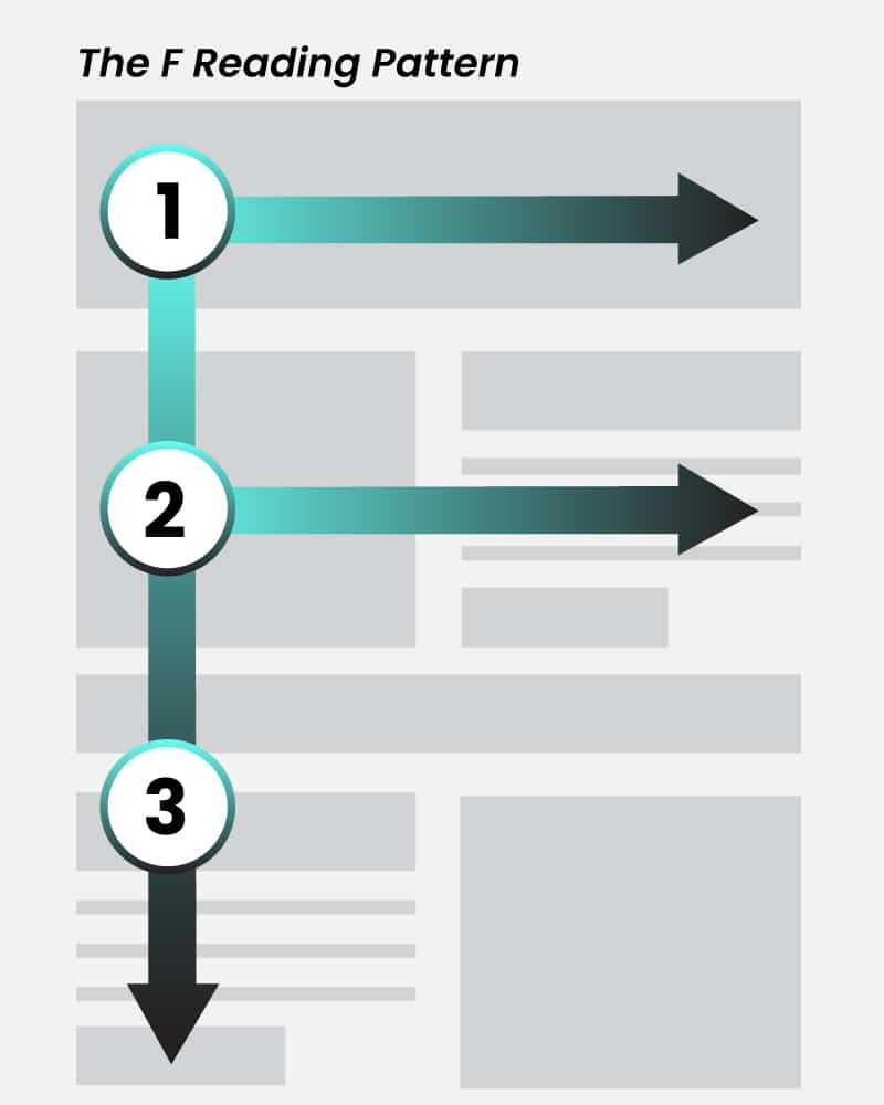
Takeaways from F reading pattern:
- Placing the most important information at the top of the page
- Using clear, easy-to-understand headings
- Breaking up content into easily scannable sections
- Adding visual content to make the reading experience more enjoyable
The Hot Potato Reading Pattern:
Readers observe the hot potato reading pattern when their short attention span comes into play, causing them to scan a web page for the information they need quickly. Users tend to focus on elements that can immediately capture attention and then swiftly move on to the next detail. The name comes from the tendency of people to switch hands when handling a hot potato.
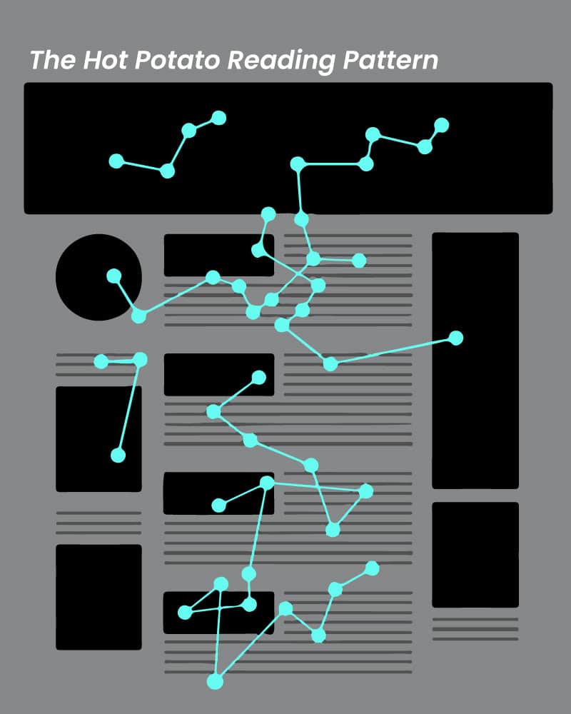
Takeaways from the hot potato reading pattern:
- Use short and to-the-point headings
- Make use of bullet points and lists
- Prioritize presenting important information first
- Add visual content
Gutenberg Reading Pattern:
Named after the inventor of the printing press Johannes Gutenberg, this reading pattern is based on the idea that users tend to read text-based content in a hierarchical manner.
The most important information, therefore, is located at the top of the page, followed by less important information being located further down.
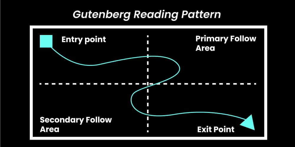
The Gutenberg reading model is divided into 3 main sections:
- Primary optical area: The page’s top-left corner is where the user starts reading. It is the most crucial part of the page and will contain absolutely important information
- Strong fallow area: The user’s eye will move to the top-right corner of the page after covering the primary optical area
- Weak fallow area: The bottom half of the page where the reader’s eyes land after scanning the page’s top parts. It is the least important part of the page and can contain secondary information
Takeaways from the Gutenberg reading model:
- Place important information at the very top of the page
- Break content into more readable parts
- Use crisp and clear headings
- Include visual content
Test native ads:
Native ads can effortlessly blend into the surrounding content and appear more natural instead of being intrusive. This can greatly reduce banner blindness when compared to traditional banner ads.
With the right non-disruptive ad placement strategies (in-feed ads or even sponsored content), a brand can create a user experience that is more seamless and engaging at the same time. These work best on websites as well as on mobile ads.
Consider video advertisements:
Videos are often more engaging than text content & are excellent for reducing banner blindness as they capture user attention almost immediately. Unlike static banner ads, video ads are a combination of motion graphics, animations, and sound effects. These are interactive – creating an immersive experience for the viewer.
Additionally, video ads are versatile. An advertiser can place them at various locations to target specific audiences based on interests, demographics, and user behavior. These are the factors that increase an ad’s relevance and, as a result, make it more effective. Be sure to keep your video ads to the point and not too pushy.
Note: Video ads are more interactive than static banner ads while also conveying more information.
Banner Blindness – Avoiding the Puddles to Create Exceptional Banner Ads Experience
Banner blindness is a nightmare that keeps advertisers awake on a regular basis. It not only affects their ads strategy but also results in wasted ad spending. Over the years, readers online have evolved to look past banner ads if it’s not informative enough, are irrelevant, or don’t seem convincing enough.
While banner blindness is scary, there are ways advertisers can make every penny count. And for times when you need more than just solutions, Mastroke is always here to help.
About The Author