Unlocking the Secrets of Color Psychology in Branding
Color Psychology in Branding is an intriguing concept, as it delves into the connection between the human brain & its response to colors.
As colors are the easiest to remember when encountering new things, a mere glimpse of a particular color can trigger recognition and recall.
It’s fascinating how something as simple as a color can profoundly influence our memory. So, the next time you come across a familiar color, take a moment to appreciate how effortlessly it brings back memories & associations.
What is Color Psychology?
Color psychology studies how color influences our perception of the world and helps us understand how we engage with brands.
It provides a framework for designing more meaningful and memorable brand experiences.
Research indicates that color alone influences up to 90% of snap judgments made about products.
This study reveals the tremendous influence of color on consumer perceptions and decision-making.
According to this concept, colors have a deeper impact on human behavior than commonly believed. They can shape even the most minor aspects of our lives, including our daily moods & preferences, such as food choices.
How color psychology affects your brand
The connection between emotions and behavior is undeniable, and colors can evoke specific emotions in target audiences.
Studies indicate that colors have various effects on human behavior. They improve our decision-making by 70%, our recall by 60, and the selling potential by 80%.
Color is vital for conveying your brand story and emotionally engaging with your target audiences. If you want to communicate your brand story, delving into color psychology can be a game-changing strategy.
Color Theory
By understanding how colors work together, you can change the look & feel of your branding and stand out.
Additionally, Color Theory plays a crucial role in creating impactful visuals.
Moreover, the right color choices can help you develop better collaterals like a website, social media presence, logo, effective CTAs, and more.
Consequently, these choices will result in conversions and enhance brand performance.
How to make the right color choices
Creating aesthetically pleasing experiences begins with understanding the rules & guidelines of color usage.
By understanding the basics of Color Theory, you can create logical color structures and strategically utilize color palettes to evoke emotions in your consumers.
How you can create Aesthetically Pleasing Color Combinations
When analyzing visual elements, an important lesson for marketers is understanding the color wheel.
A color wheel is a basic model combining colors, enabling designers to discover optimal color combinations. It can help you blend colors & create visual harmony in your branding.
To leverage the impact of color psychology in your branding strategy, it is essential to comprehend this concept.
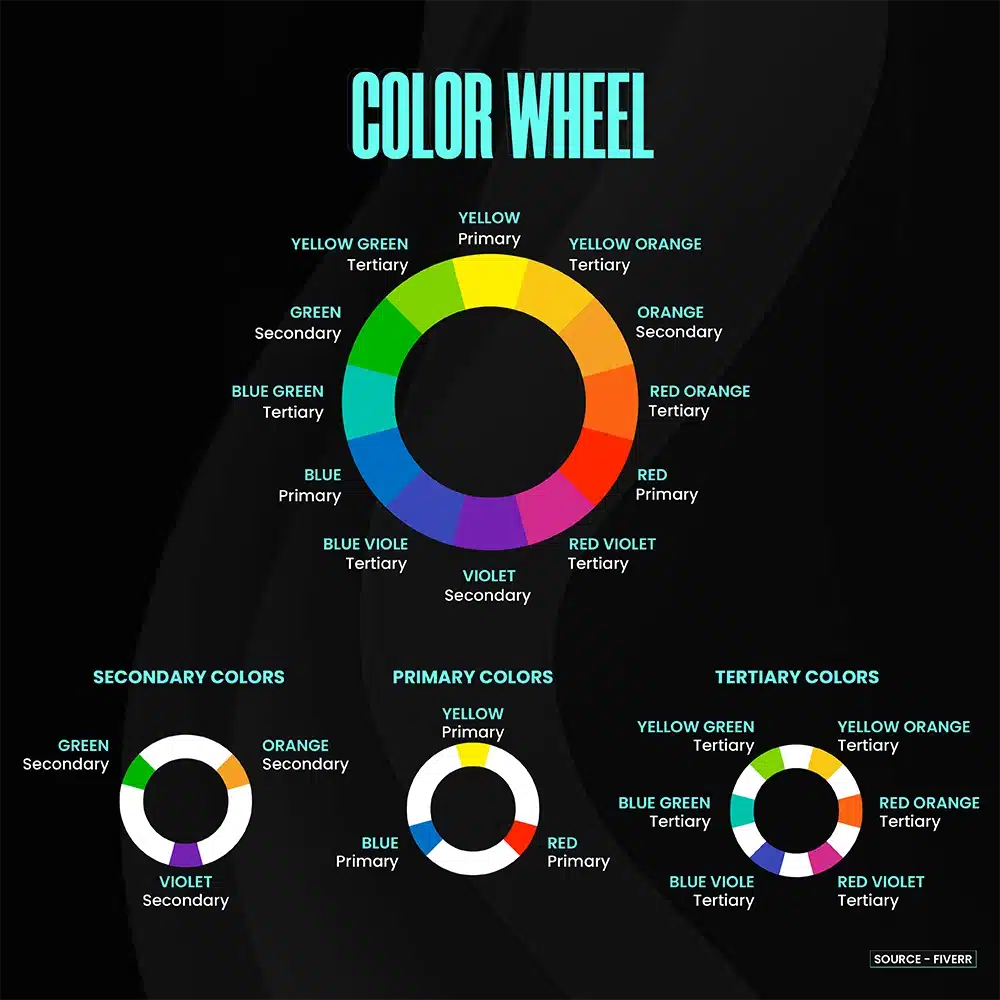
Isaac Newton’s discovery in 1666 traced the origins of the color wheel. He revealed that white light breaks down into seven distinct colors, also known as rainbow colors.
The color wheel includes the following key elements:
- Primary colors: Red, blue, & yellow
- Secondary colors: Green, orange, & purple
- Tertiary colors: Colors like aqua or violet. Created by mixing primary and secondary colors.
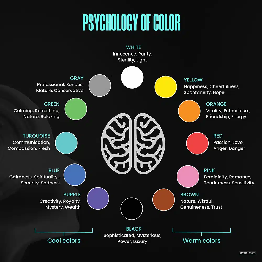
Colors fall into two categories:
- Cool colors: Blues, greens, and purples fall into the cool color category. These colors are often associated with cooler seasons like winter and spring and feelings of tranquility & serenity.
- Warm colors: Reds, oranges, and yellows belong to the warm color group. These shades are typically linked to warmer seasons, such as summer and fall, evoking sensations of energy, movement, & liveliness.
In addition, it’s essential to pay attention to color harmonies. Designers, marketers, & brands commonly use specific color schemes, including:
- Complementary: This scheme pairs colors from opposite sides of the spectrum, creating a vibrant contrast.
- Analogous: Neighboring colors on the color wheel can be combined in this scheme, resulting in harmonious combinations. For instance, red and orange or blue and green can be blended to create visually pleasing & balanced palettes.
- Triadic: Designers often use a triadic color scheme to incorporate multiple colors. It involves selecting three colors evenly distributed around the color wheel.
These color schemes offer different aesthetics and can help you utilize the full potential of color psychology in branding.
Colors & the way they impact consumers
I. Color Psychology Of Red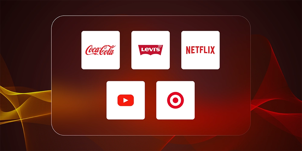
Red is a powerful color that stimulates our emotions by increasing our heart rate.
As a warm color, it radiates warmth and energy and captures attention.
Red = Strong Emotions
Red evokes the strongest emotions of any color.
It is associated with blood, lips, the tongue, and the heart.
These all have strong and primal emotions tied to them, including life, death, eating, aggression, love, and desire. Balloons, gift cards, and other items prominently feature red on Valentine’s Day.
Red = Urgency
Red’s ability to create a sense of urgency makes it effective for driving impulse purchases.
In an A/B test, HubSpot found that the red CTA button worked better than the green one by 21%.
Considering this, designers intentionally use red for the “call to action” (CTA) buttons to attract customers.
Red = Food
Restaurants, mainly Italian and pizza establishments, commonly use red in their logos, signs, packaging, and decor. This preference is likely due to the reference to tomatoes and red sauce.
Fast-food giants such as McDonald’s & KFC incorporate red in their branding.
In addition, there’s a widespread belief that red can stimulate hunger, although no conclusive evidence exists.
Red = Health
Healthcare companies often choose red as their primary brand color due to its connection with blood.
The Red Cross, providing aid during the Civil War & disaster relief, has long used red.
In the United States, well-known drugstores like Walgreens and CVS feature red prominently.
Healthcare product brands such as Band-Aid and Johnson & Johnson also incorporate red into their branding.
Exploring the Realm of Red Color Psychology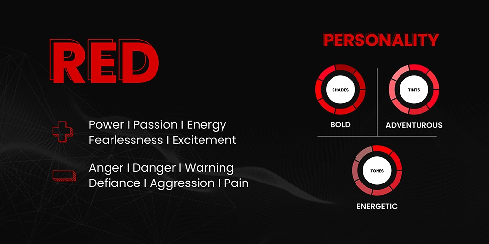
II. Color Psychology Of Blue
While red symbolizes the body, blue evokes the realm of the mind.
Blue embodies clarity and facilitates effective communication with its serene and calming nature.
It is the most widely favored color globally, especially among men.
More than 33% of brands opt for blue as their primary color, recognizing its reliability and trustworthiness.
Blue = Water
Blue, representing the color of oceans, strongly associates with aquatic environments.
Despite clean water being typically colorless, most bottled water brands use blue in their packaging.
Depending on your business, incorporating the color blue can establish a connection with water and its connotations.
Blue = Clean or Pure
Blue is associated with purity, evoking the freshness of water and clean air.
The color theory of blue aligns with the concept of cleanliness, leading many brands to adopt it for a pure and almost medical aesthetic. This is evident in brands like Nivea, Noxzema, and Oral B.
Blue = Likable
People in the United States frequently cite blue as a favorite color.
Very few people dislike blue, making it a universally appealing choice. This is one of the reasons why social networks like Facebook, Twitter, and LinkedIn have all used blue in their logo designs.
Blue = Business
Corporate brands often opt for blue as their preferred color choice, given its long-standing association with suits, ties, and button-down shirts.
Look at IBM; they famously adopted a blue-striped logo to evoke the connection with pin-striped suits.
Brands like American Express, GE, and Chase, also prominently feature blue in their logos.
Exploring the Realm of Blue Color Psychology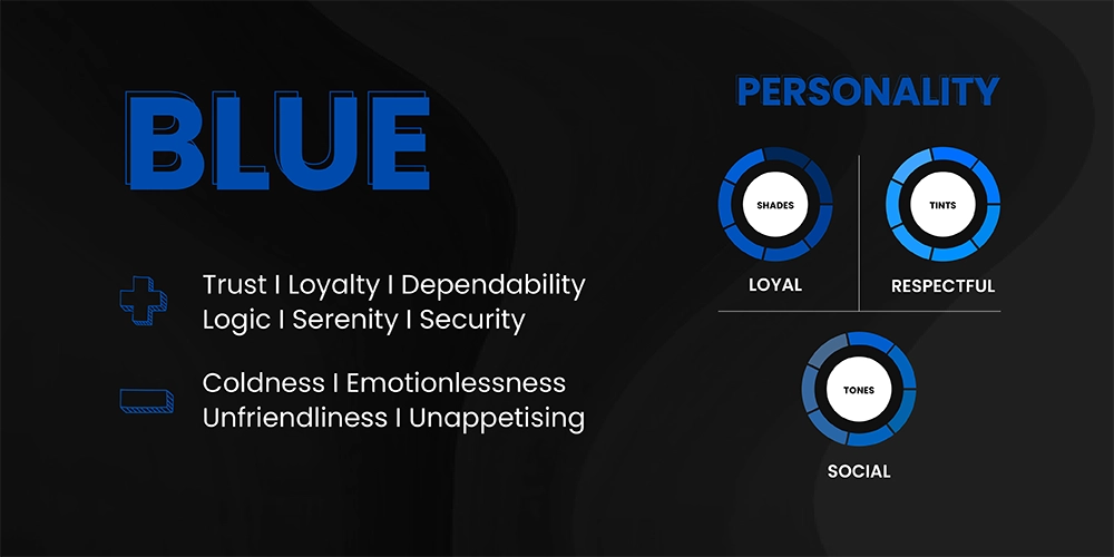
3. Color Psychology Of Green
Green is soothing for our eyes because it doesn’t require any adjustment when it reaches the retina.
It has a calming and relaxing effect. That’s why performers waiting to go on stage or on television often spend time in “green rooms” to relax their nerves.
Additionally, green improves vision and is commonly used in night vision due to our eyes’ ability to distinguish shades of green.
Green = Nature
Green is a natural choice for all-natural products and nature-supporting organizations.
It represents abundant natural colors, with green being the predominant hue associated with growth and vitality.
Many organic and eco-friendly brands incorporate green in their branding, packaging, or marketing to emphasize their commitment to sustainability.
Green = Money
The color green is linked to financial products & services in the United States as their paper currency is green.
Well-known financial brands like Fidelity and TD Bank use green in their logos. Many wealth management firms and financial planners also use dark green in their branding to reinforce this connection.
Green = Luxury
Using deeper shades of green in branding can evoke a sense of prestige and wealth, adding a touch of luxury.
Izod Lacoste, Rolex, and Land Rover, among other renowned brands, strategically utilize deeper shades of green in their branding to add a touch of luxury to their image.
Exploring the Realm of Green Color Psychology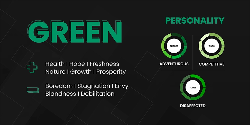
IV. Color Psychology Of Black
Black = Elegance & Upscale Fashion
Black is a timeless and sophisticated choice in the fashion world. It’s always in style- from a black tuxedo to a black dress.
Luxury brands, especially in fashion, often use black in their logos and as their primary brand color. Companies can achieve a sense of timeless elegance by utilizing a black logo. This versatile color choice allows for pairing with different colors based on the product line, season, or evolving trends.
Black = Strong
Black stands out among other colors for branding as it maintains a 100% solid appearance without any shades or tints. This attribute gives it a strong and bold quality.
Numerous sports brands opt for black as their primary color, leveraging its symbolism of strength and intensity in color theory.
Black = Simple/Neutral
Choosing black and white printing over color used to be a money-saving choice. However, this has become less significant with the rise of digital media.
Nevertheless, black text on a light background continues to be widely popular for its readability in various mediums such as books, newspapers, emails, & websites.
If you choose black as the primary color for your branding and marketing, it is essential to approach this decision with deliberate design intent.
This means carefully considering how black represents your brand and ensuring it doesn’t unintentionally convey a cheap or low-quality image.
Exploring the Realm of Black Color Psychology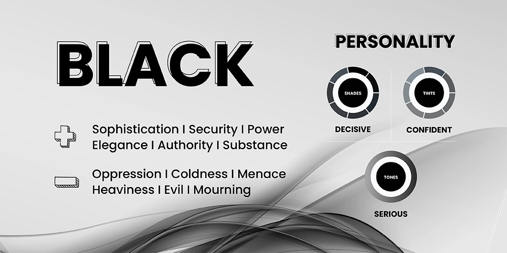
V. Color Psychology Of Purple
Purple = Royalty & Fantasy
Purple has a regal history, symbolizing power & prestige.
In ancient times, only royalty could wear this color. Queen Elizabeth I even limited its use to the royal family. The rarity and cost of the dye used to create purple contributed to its elite status.
Purple also has a mystical quality associated with dreams & spiritual pursuits.
It stimulates a sense of beauty and inspires creativity. When surrounded by purple, people tend to have a heightened appreciation for aesthetics and a greater receptiveness to innovative ideas.
Purple = Courage & Excellence
Purple carries different meanings in various cultures. In the United States, the Purple Heart holds great prestige as a military award, representing acts of bravery and exceptional service during times of war. It symbolizes honor and recognition for those who have demonstrated extraordinary courage.
Purple also represents excellence. The Wimbledon logo, for example, incorporates shades of purple and green to represent the tournament’s prestigious grass courts & the sophisticated nature of the championship.
Purple = Compassion
Purple is a color that speaks of love at its core.
It embodies warmth, compassion, and a call for peace. Purple encourages us to embrace love and fearlessly show empathy and kindness towards others.
Exploring the Realm of Purple Color Psychology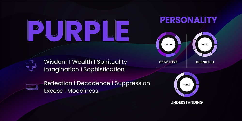
How You Can Choose The Right Colors For Your Brand
A. Define your brand’s color scheme
When defining your brand’s color scheme, one common question arises: how many colors should you incorporate?
Upon analyzing renowned brand color schemes, a consistent pattern emerges, consisting of three key elements:
- Base color: This dominant color embodies your brand’s personality & appeals to your audience.
- Accent color: As a secondary color, it complements the base color and conveys an additional aspect of your brand’s identity. It should harmonize with the base color and resonate with your audience.
- Neutral color: Acting as a subtle hue, it unifies your color palette without overpowering it. This category includes background-friendly shades like whites, beiges, and grays.
B. Choose a color palette according to your brand personality
Choosing colors for your brand involves understanding their impact on perception. Research suggests that people prefer brands that align with their lives and become part of their identities.
To narrow down your color palette, consider your brand’s personality and the impression you want to make on your target audience.
Consider using energetic colors like pink and yellow for fun and vibrant branding.
On the other hand, if you aim for a sense of seriousness and maturity, consider incorporating colors like blue and gray.
You can leave a lasting impact by aligning your colors with your brand’s identity and desired perception.
C. Choose a Color That Attracts Your Target Audience
Understanding your target audience is fundamental in branding and applies to selecting. Choosing the right color for your brand starts with deeply understanding your target audience.
Conducting customer research is essential to gain insights into the individual you serve, and creating a buyer persona can represent your target audience.
Once you have defined your persona, carefully consider which colors will likely resonate with that individual. Consider gender, energy level, style preferences, and emotional characteristics.
Your brand’s color should align with the defining traits of your target audience, whether masculine or feminine, energetic or understated, passionate or practical.
D. Get Inspired By Others
Before creating your brand colors, look at your competitors’ palettes and analyze their effectiveness. Learn from their color choices while maintaining your uniqueness.
Online color palette generators are fantastic resources for discovering interesting color pairings and captivating shades. They offer a wealth of inspiration. You can Explore logo color ideas to spark creativity and generate new concepts.
Takeaway
As the famous saying goes, “You never get a second chance to make a first impression.” And when it comes to your business, that initial impression is often formed through your brand colors.
Selecting the right color for your brand is critical to crafting a solid and meaningful visual identity.
It should be authentic, reflecting your brand’s essence while resonating with your target audience.
Are you ready to kickstart your branding journey? Click here to access our expert assistance in creating a compelling brand from the ground up. Let us guide you toward establishing a powerful and impactful brand presence.

